Chain | Cohn | Clark Website + bilingual experience + consultation journey
A legal website designedfor the moment someoneneeds to act.A legal websitedesigned for themoment someoneneeds to act.
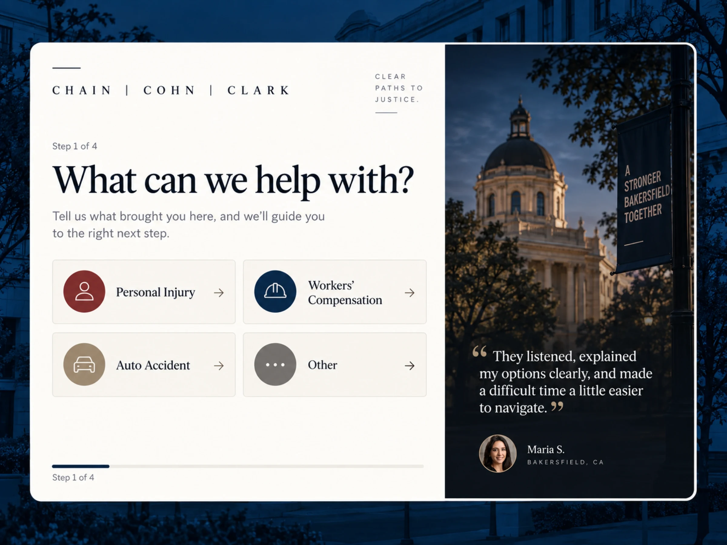
Collins Creative designed and built Chain | Cohn | Clark’s digital experience around clear navigation, bilingual content paths, and a guided way to begin a conversation, on desktop and mobile.

The finished website, interactive
Find your situation.
Take the next step.
This is the working site, not a mockup. Browse the practice areas, switch to Español, and open the four-step consultation on desktop or on a phone. Submissions are disabled inside the preview.
The challenge
A broad legal site still needs to feel easy to navigate.
People arriving at a law firm’s website need to recognize their situation, find the right information, and know what to do next, without having to understand the firm’s internal organization first.
Our work was to turn a large amount of content into a clear, calm, responsive route through the site.

Designed for the phone
Every section,
one thumb away.
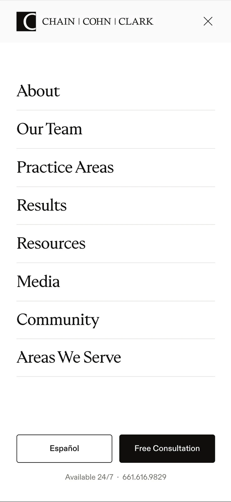
Practice areas, people, resources, and local information in one full-screen menu, with the consultation action kept in view.

Navigation system
Every practice area,
one clear path.
No maze.
We built a navigation system that lets visitors browse the firm’s areas of practice, people, resources, and local information while keeping a consultation action visible at every level.

Only Trust Local.
A serif for the firm’s name and headlines, a plain grotesque for everything a visitor has to read quickly, and one red for the action that matters.
What we built
One system for finding the right information
and taking the next step.
The work connected the site’s content architecture, navigation, responsive behavior, language paths, and consultation entry point into one coherent experience. Every interface decision has a job: help a visitor move from an unfamiliar legal situation to a useful page, a confident next click, or a structured first conversation.
What we made
One firm, one clear
route through it.
Content architecture
Organized practice areas, attorneys, resources, and local information so a visitor can recognize their situation and reach the right page without learning the firm's structure first.
Navigation system
Built a navigation that carries the whole site on desktop and collapses into a single full-screen menu on a phone, with the consultation action visible at every level.
Bilingual experience
Designed English and Spanish paths that keep the essential information and the same next steps consistent across both.
Guided consultation
Created the four-step first contact, and the dashboard concept behind it, so each inquiry arrives with its matter type, language, and status.
Clear at the moment
it matters most.
Design & front-end

Brendan leads UI/UX, branding, and front-end execution, making software simple, clear, polished, and easy for real people to use.
Meet the studio →What are you working toward?
Tell us what the brand needs to do, who it is for, and when you need it. You will get a straight answer on scope, timing, and cost.
Start a projectMore Collins Creative work