Concepts of Ink Homepage design directions
One print shop,five ways to look.One print shop,five waysto look.
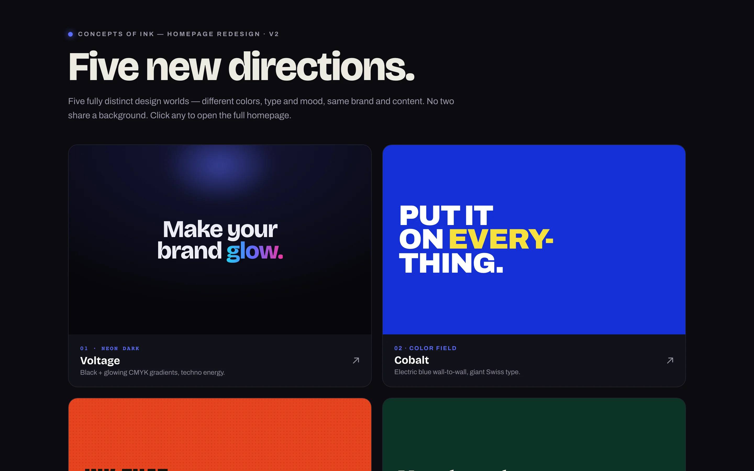
Collins Creative designed and built five complete homepage directions for Concepts of Ink, a Bakersfield print and embroidery shop. Each uses the same content and structure with its own color, type, and mood, so the choice is about the look alone.
The directions, interactive
Pick a direction.
Then the next.
Start on the index, open any of the five homepages, and use the numbered bar at the bottom of each page to switch directions, on desktop or on a phone.
Call buttons are switched off in this copy, and sample reviews the shop has not confirmed are hidden.
The directions
Same shop.
Five design worlds.
Instead of mood boards, we built every direction as a working homepage. An index page sets them side by side and opens each one in full, so the shop can compare real pages at real size.
Static proof from the five homepages
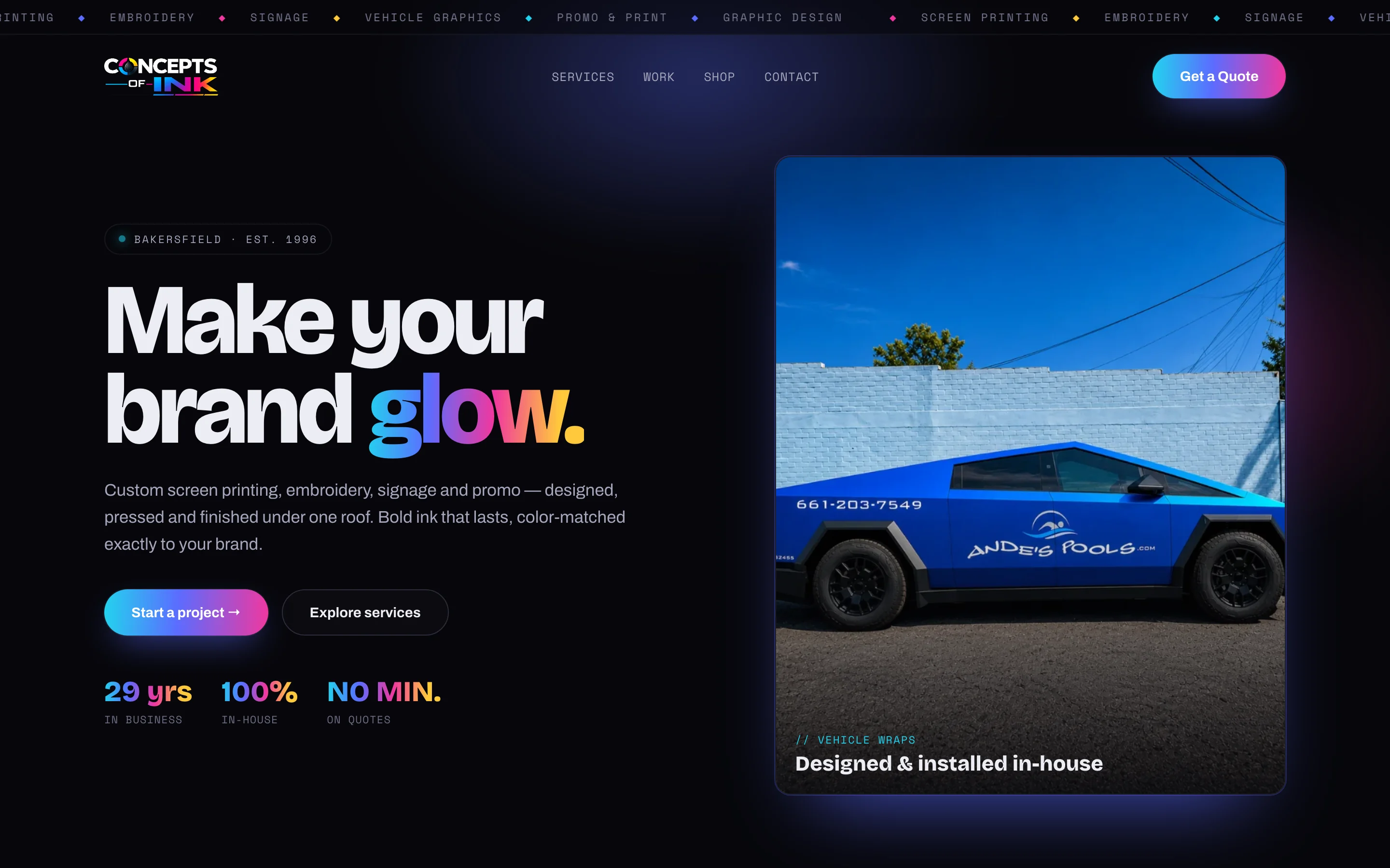
About these captures These are design directions, not the shop's live website. Some sample copy in them has not been confirmed with the shop: the interactive copy above hides a sample testimonial and a "rated by locals" line, and its call buttons do nothing.
The challenge
A look is hard to pick from a sketch.
Concepts of Ink has served Kern County since 1996 from one shop on California Avenue, doing screen printing, embroidery, signs, vehicle graphics, and print. A shop that sells visual work needs a homepage that shows taste, and taste is hard to judge in the abstract.
We held the content still and changed only the design, so each direction answers one question: does this feel like the shop?

On a phone
Each direction
holds up small.
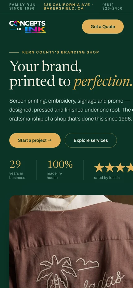
Every direction was built for phones as well. The headline, a short description, and two actions fit on the first screen, and each keeps its own type and color instead of falling back to a shared mobile template.


What stays the same
One structure
under every look.
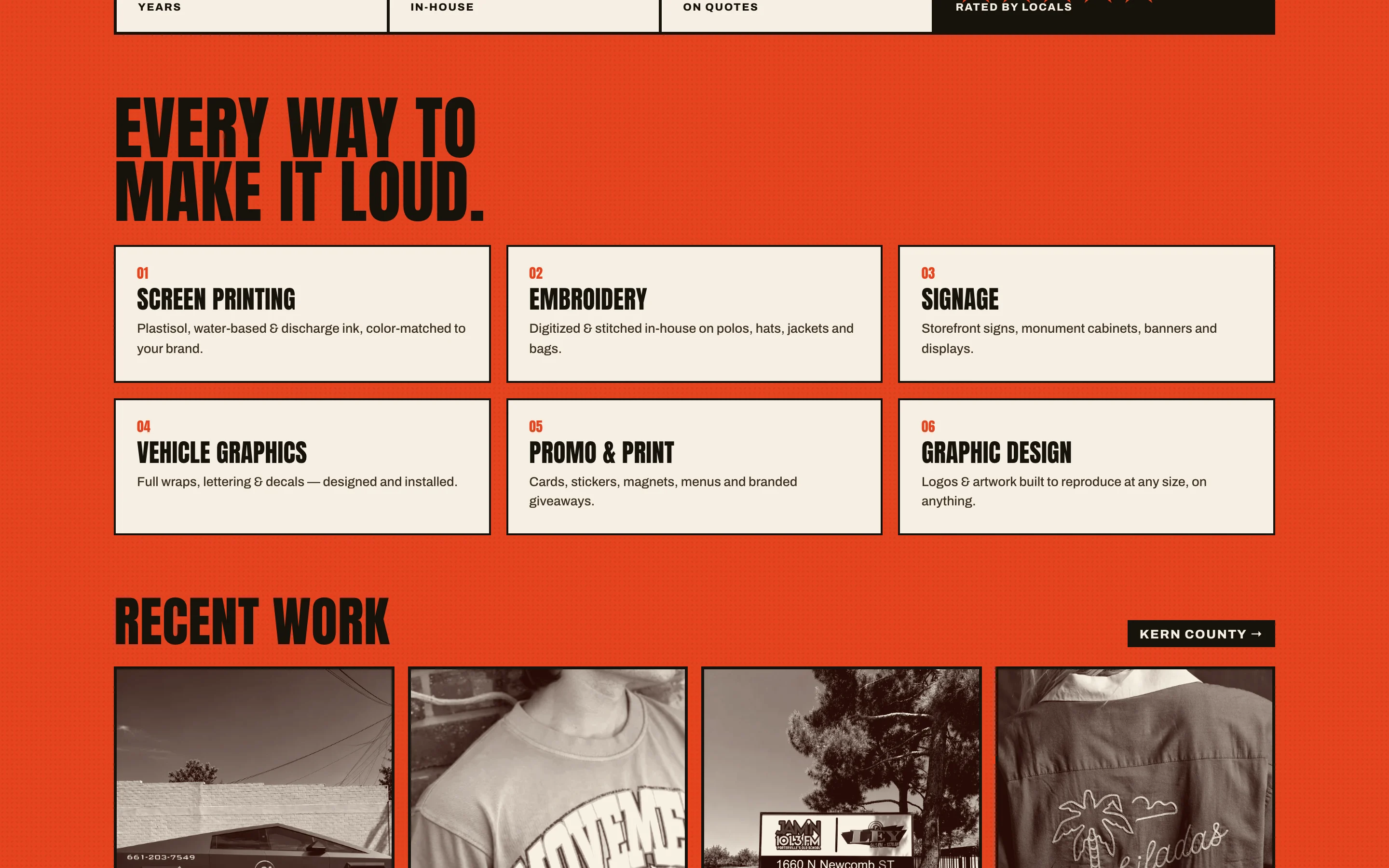
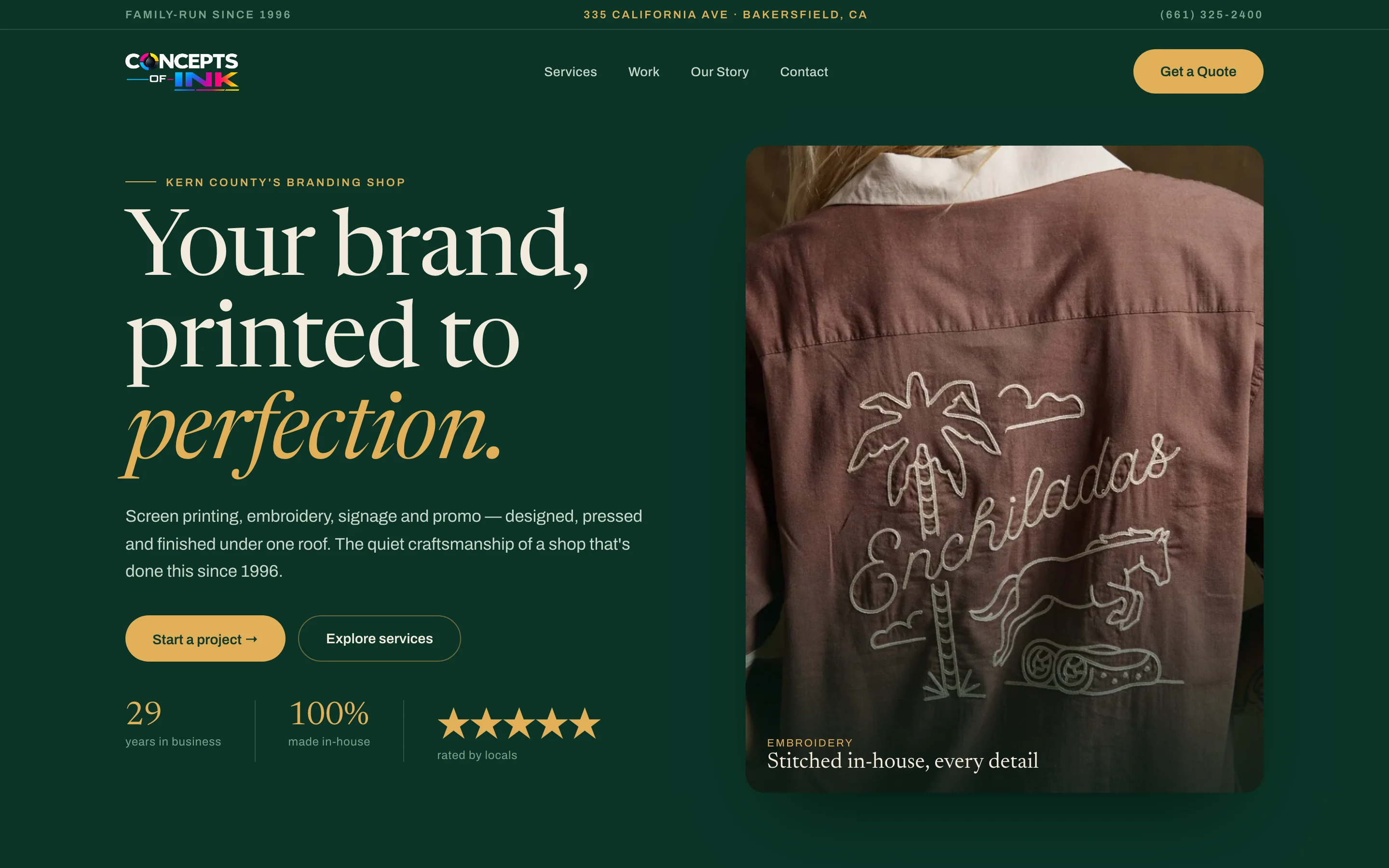
Every direction follows the same order: a headline and two actions, the shop's departments, recent local work, and a call or quote request. Whichever look the shop picks, the content and the path to a quote carry over unchanged.

What we made
Five homepages,
ready to compare.
Concept index
A dark selector page that previews all five directions and opens each one in full.
Five homepage directions
Voltage, Cobalt, Overprint, Emerald, and Acid, each a complete page with its own palette and type.
Shared content model
One set of sections, departments, and contact details used by every direction.
Responsive front end
Plain HTML and CSS with no build step, designed for desktop and phone.
Hold the content still.
Let the look do the talking.

Project lead
Brendan Collins
Brendan led the art direction, UX/UI design, and front-end build for the Concepts of Ink homepage directions.
The judgment that mattered was keeping the comparison fair. With the same words and structure in all five, the shop can choose a look without also choosing between different messages.
Meet the studioYour next chapter
Not sure which look
fits your brand?
We can build real options side by side so you can choose from finished pages instead of sketches.
Start a project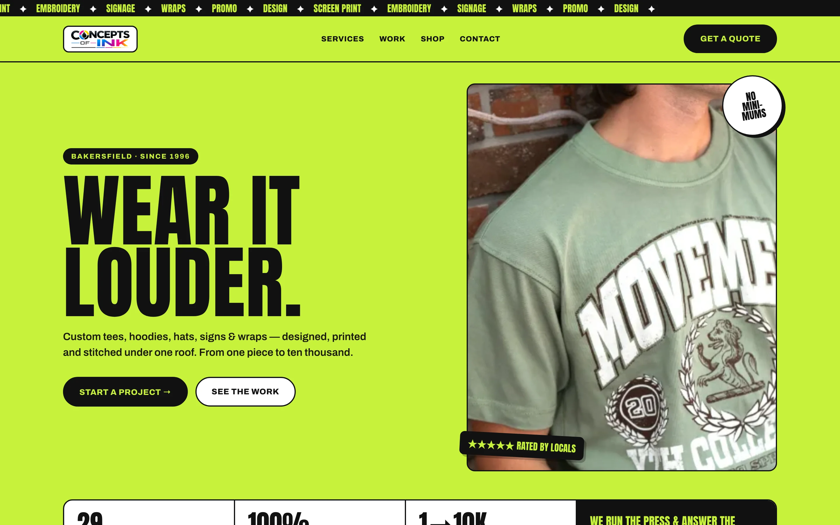
More Collins Creative work