Shalem Photography Senior portrait website redesign
A lookbookthat ends in a booking.A lookbookthat ends ina booking.
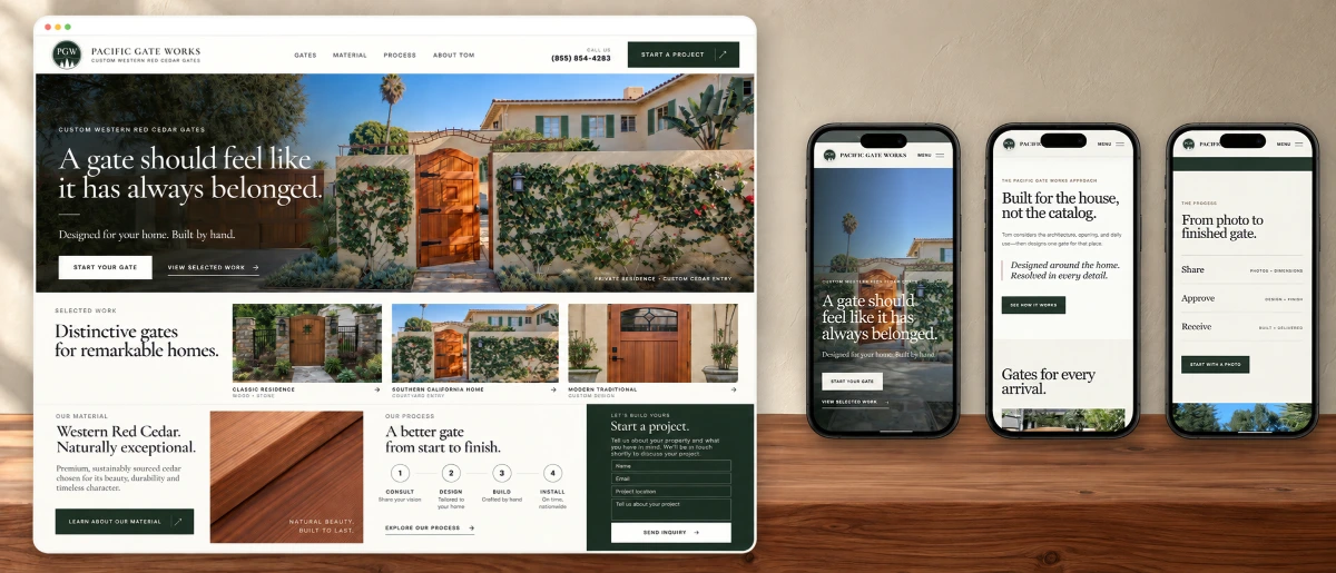
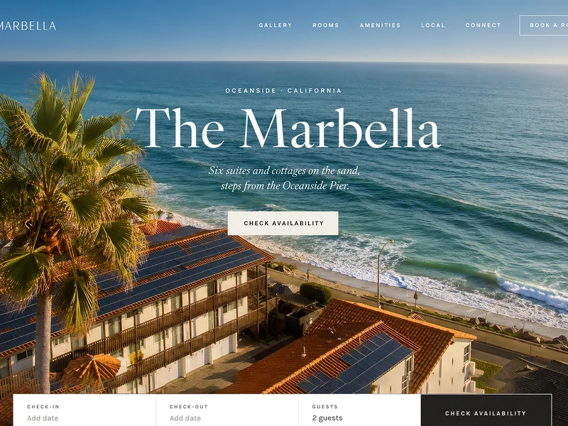
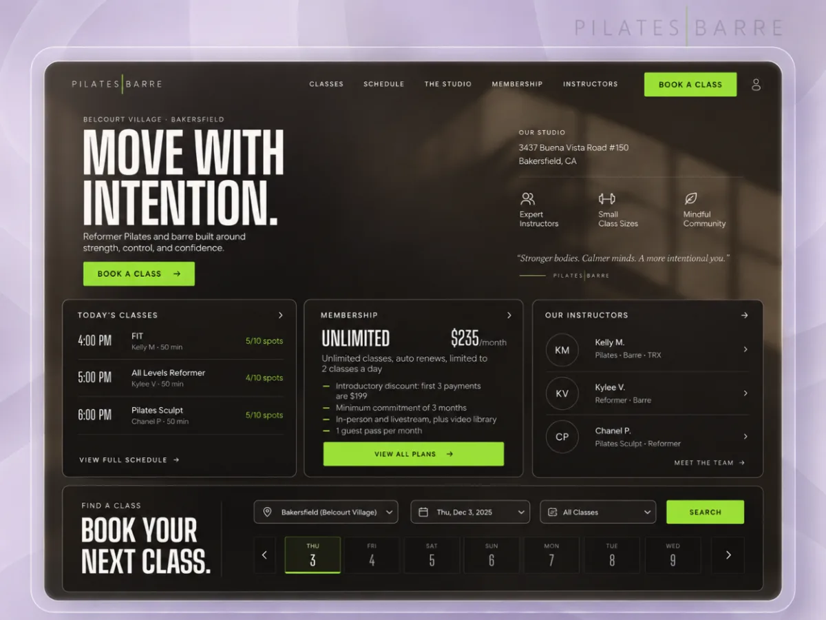
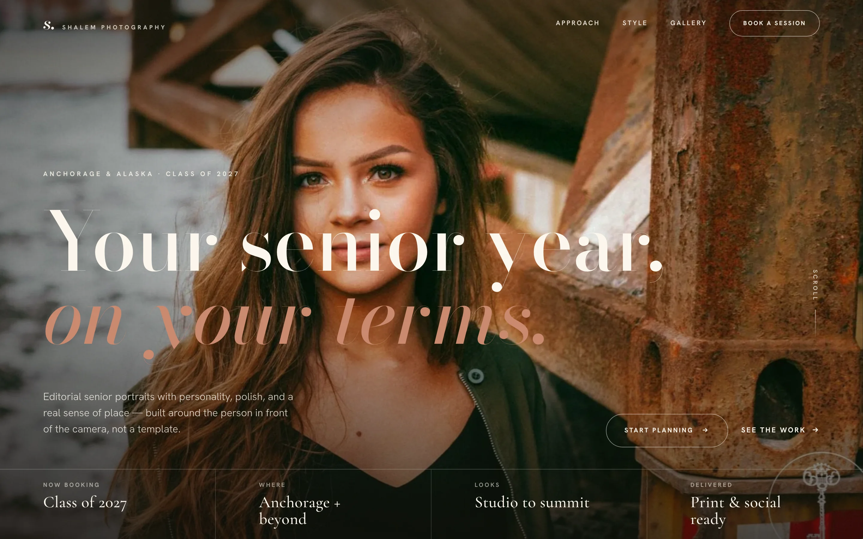
Collins Creative redesigned the senior portrait page for Shalem Photography in Anchorage, Alaska: one page that reads in chapters, three style directions a senior can choose from, a four-step session plan, and a short inquiry form, designed separately for the phone.
The redesign, interactive
Read it like
a magazine.
Scroll the page, swipe the style directions on a phone, open the menu, and watch the booking bar appear once the hero is behind you.
The inquiry form never sent anything in this build, and it is switched off in this preview.
The challenge
Seniors book on feeling, not folders.
A senior and a parent are choosing a photographer for one session, usually by scrolling. A wall of identical thumbnails makes every studio look alike and says nothing about how the day works.
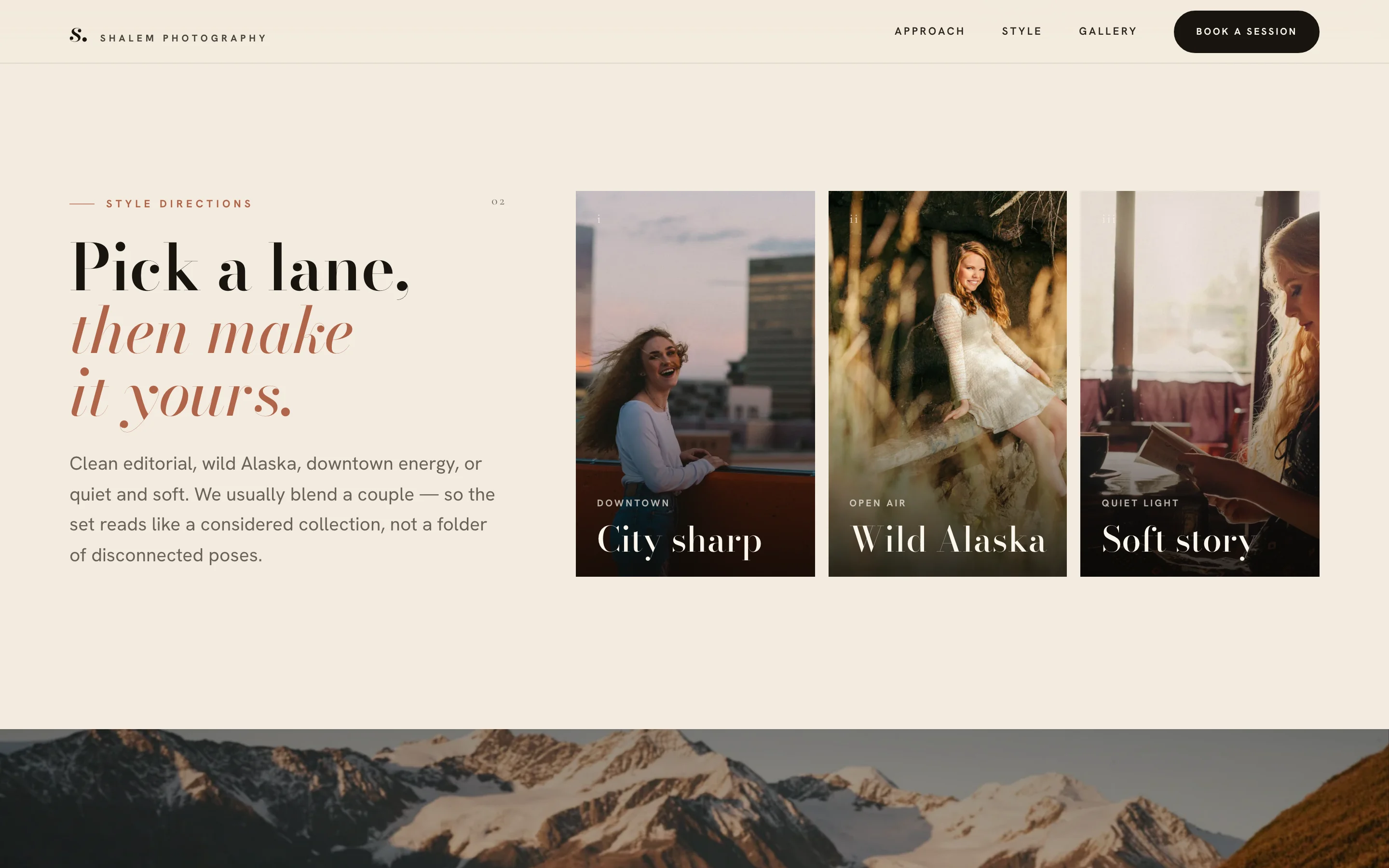
We organized the page in chapters, each answering one question in order: what the session is like, which style fits, how the day is planned, what to wear, and how to book.
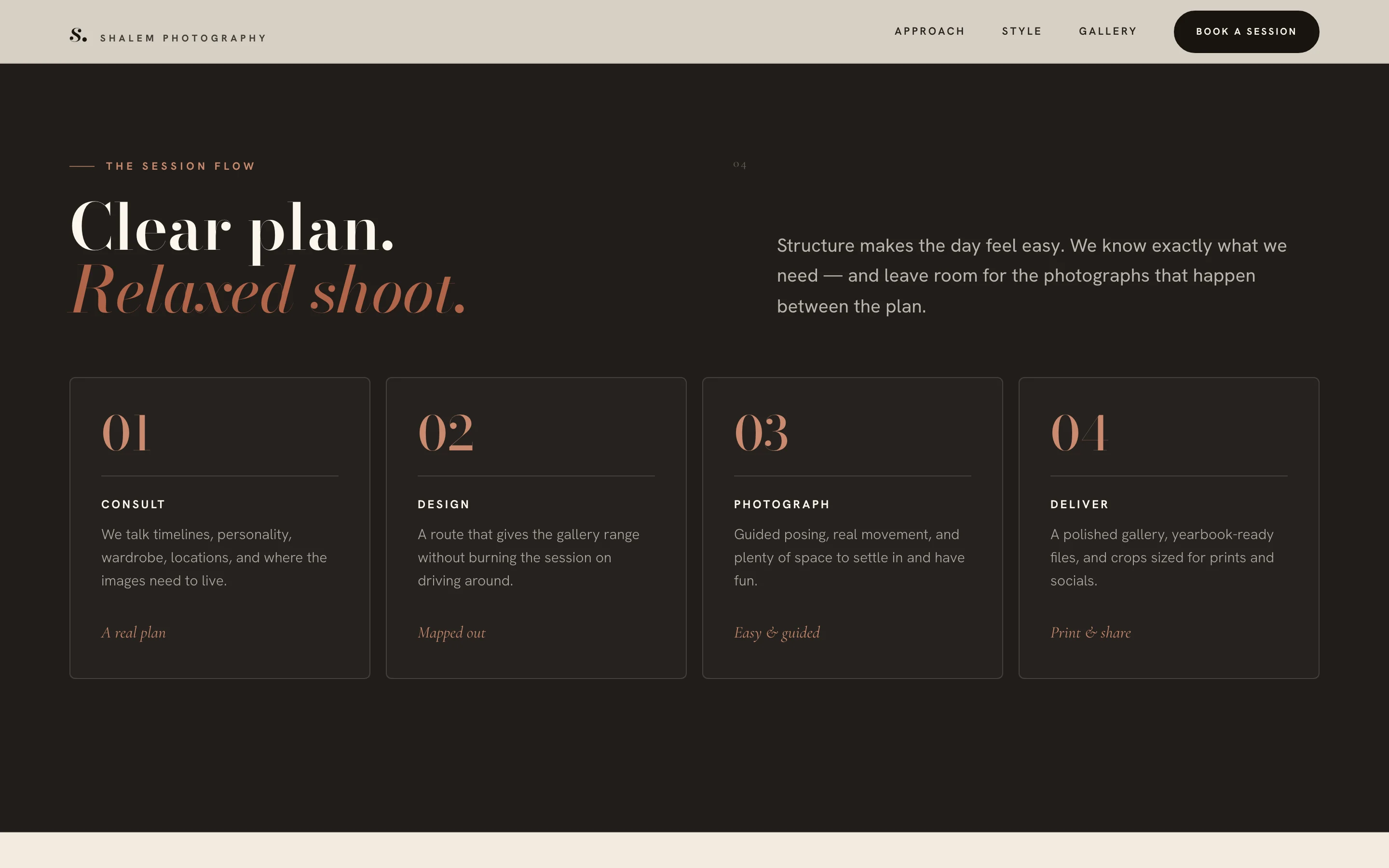
The session flow
The day, explained
before it's booked.
The process chapter answers what families ask before committing: what happens, in what order, and what they get at the end. The page closes on a short inquiry that asks only what the studio needs to reply.
- ConsultTimeline, personality, wardrobe, locations
- DesignA route with range and less driving
- PhotographGuided posing and real movement
- DeliverYearbook files and crops for prints and socials
Four steps, one row.
Five fields, then a reply.

About these screens Captured from the redesign source. The photographs are Shalem Photography's own work, shown here to demonstrate the layout. No inquiry was sent.
On a phone
Booking follows
the thumb.
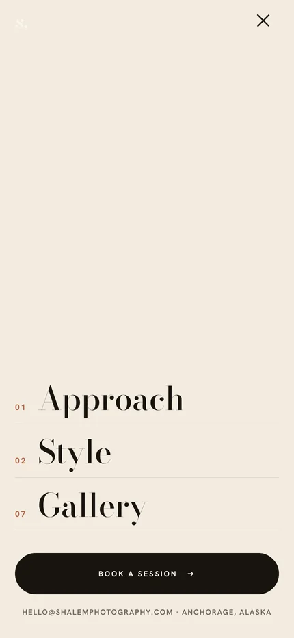
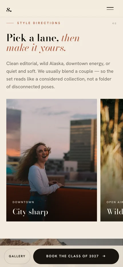
On a phone the menu opens full screen with the three chapters and a Book a session button. Once the hero scrolls away, a bar along the bottom offers the gallery and Book the Class of 2027, then steps aside when the booking form is on screen.
The style directions become a sideways swipe, so each card stays large, and the inquiry form stacks into one column under the contact details.

What we made
One page,
in chapters.
Page structure
Approach, style, an Alaska interlude, gallery, process, wardrobe, personality, and booking, each as its own chapter.
Style directions
City sharp, Wild Alaska, and Soft story as named cards on desktop and a swipeable row on phones.
Session plan and wardrobe
Four session steps and three wardrobe guidelines written to answer what families ask before booking.
Inquiry and phone layout
A five-field inquiry, a full-screen menu, and a booking bar that appears after the hero.
Show how the day works.
Then ask for the booking.

Project lead
Brendan Collins
Brendan led the design, front-end development, and copywriting for the Shalem Photography redesign.
The judgment that mattered was restraint: quiet type and generous spacing around the studio's work, and plain answers about the session before the page asks anyone to book.
Meet the studioYour next chapter
Is your portfolio
doing the booking?
If your site shows great work but leaves clients guessing about the process, we can build the page that explains it and asks for the booking.
Start a projectMore Collins Creative work