Twelve thousand SKUs. One calm homepage.
NEFCO is a family-owned construction supply distributor serving commercial jobsites from 70+ branches across the country. We reimagined their storefront — replacing a cluttered legacy site with a minimalist grid, a dark corporate palette, and a front end built around the way contractors actually buy: fast, repeat, and on a deadline.
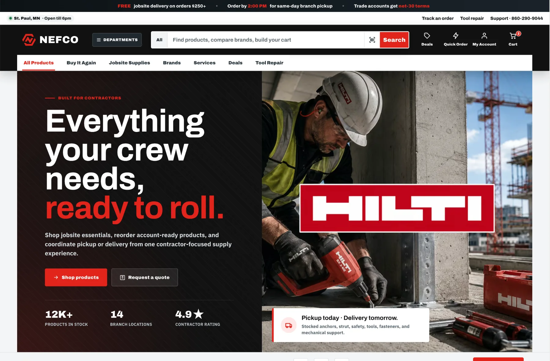
Contractors don't browse. They re-order at 6:45 AM.
NEFCO's buyers are foremen and purchasing managers with a crew on the clock — they know the SKU, they bought it last month, and they need it at the branch by this afternoon. The legacy homepage made them work for it: dense, cluttered, and organized around the catalog instead of the customer.
The brief we set ourselves: keep all of that inventory depth, but make the first screen feel like a tool, not a brochure — strict hierarchy, generous whitespace, and the three jobs that matter (search it, re-order it, pick it up today) one action away.
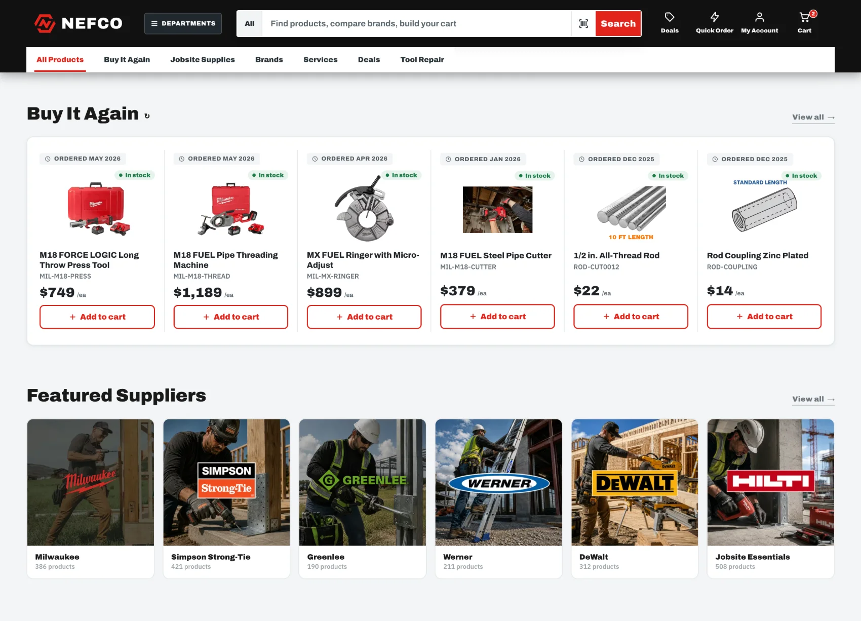
A strict grid that makes dense data feel light.
The new homepage runs on a modular grid with consistent margins and structured product cards — every price, stock badge, and order date in the same place on every card, so a contractor can scan a full row in a glance. A dark corporate palette with one jobsite red gives the brand the weight of the equipment it sells.
A search bar that thinks like a contractor.
Search is the front door of a 12,000-SKU store, so we rebuilt it from scratch. One field — "Find products, compare brands, build your cart" — opens a working command center: trending products, your recent searches, top categories with live counts, and suggested products showing price and real-time stock at your branch. There's even a barcode scan for the contractor standing in front of the empty box.

"Buy It Again" — reordering in one tap.
Most of a contractor's purchases are things they've bought before. The Buy It Again dashboard pulls past orders into the same structured cards — what you ordered, when, whether it's in stock at your branch — with an instant add-to-cart wired straight to the order API. Reordering a press tool takes one tap, not a catalog hunt.
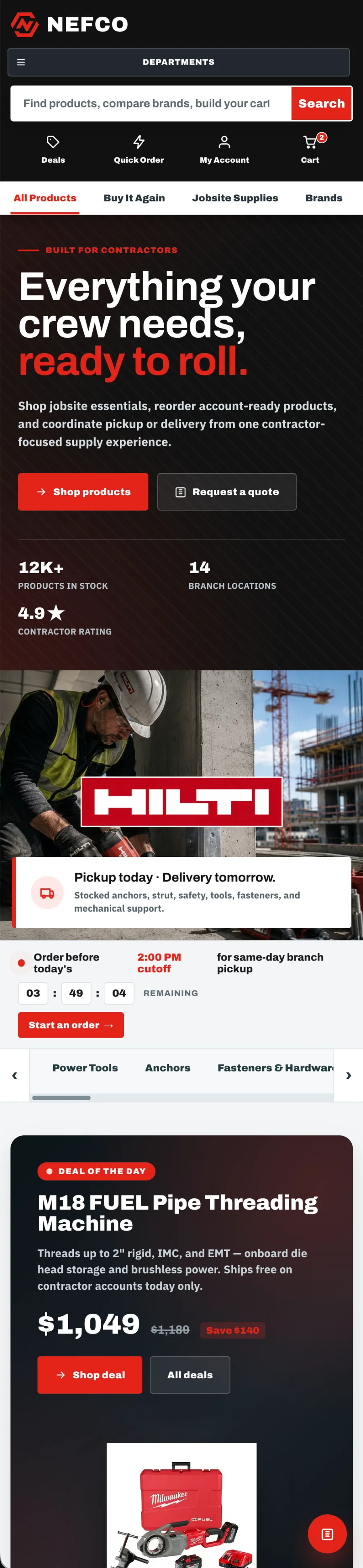
The whole counter, one thumb.
The mobile view keeps every promise of the desktop redesign — search up top, the branch tracker, the cutoff countdown, deals, and one-tap reordering — restacked for a foreman ordering from the cab between site checks.
"Our guys don't have time to shop. The new homepage knows what they need before they finish typing it."

Brendan Collins
Brendan leads UI/UX, branding, and front-end execution — making software simple, clear, polished, and easy for real people to use.
On NEFCO his focus was discipline: a strict grid and typographic system that keeps twelve thousand SKUs scannable, and front-end logic that turns repeat buying into a single tap.
Does your storefront work as hard as your customers do?
Contact us →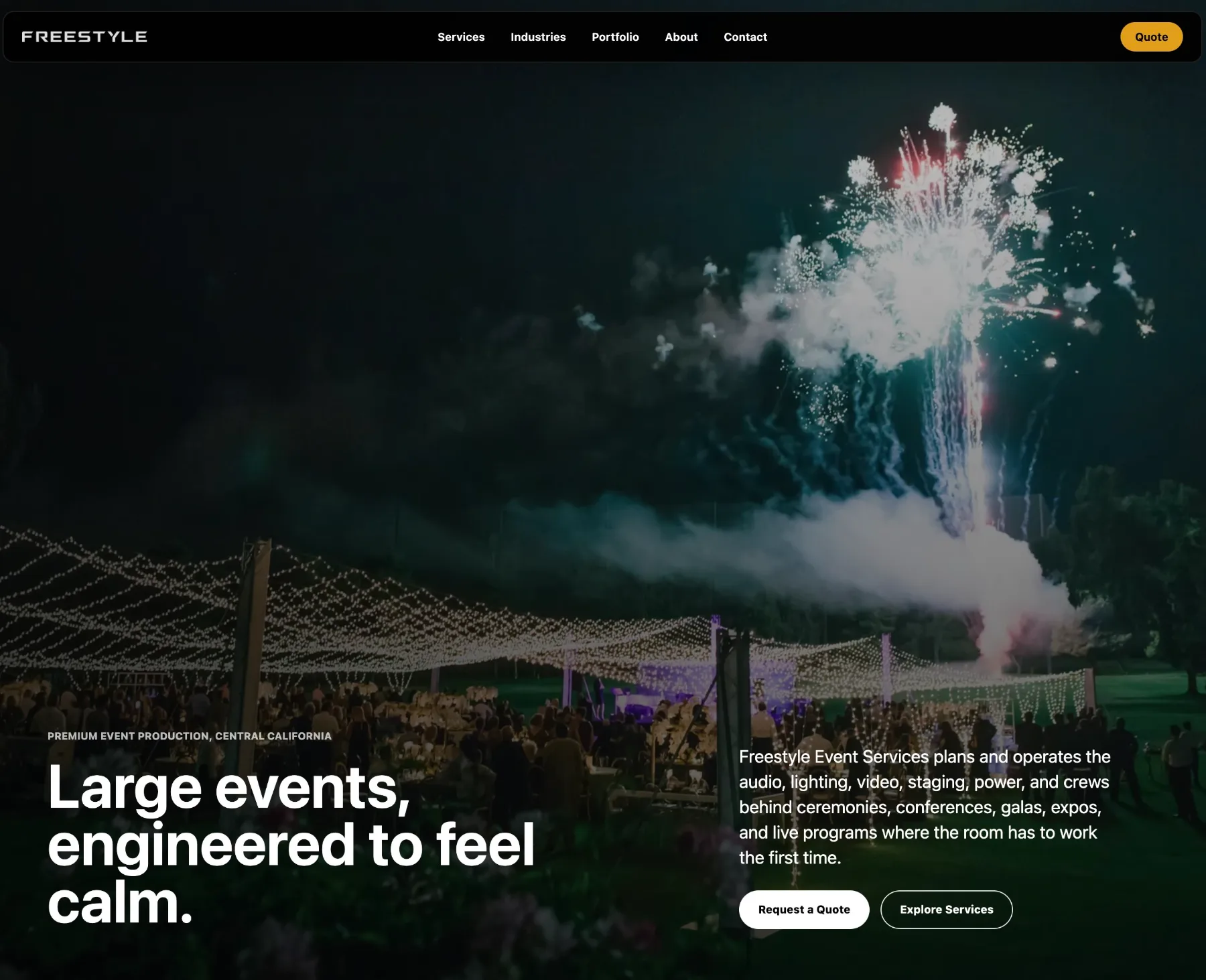
Freestyle Event Services
A cinematic, photography-led website for Central California's largest event production company.
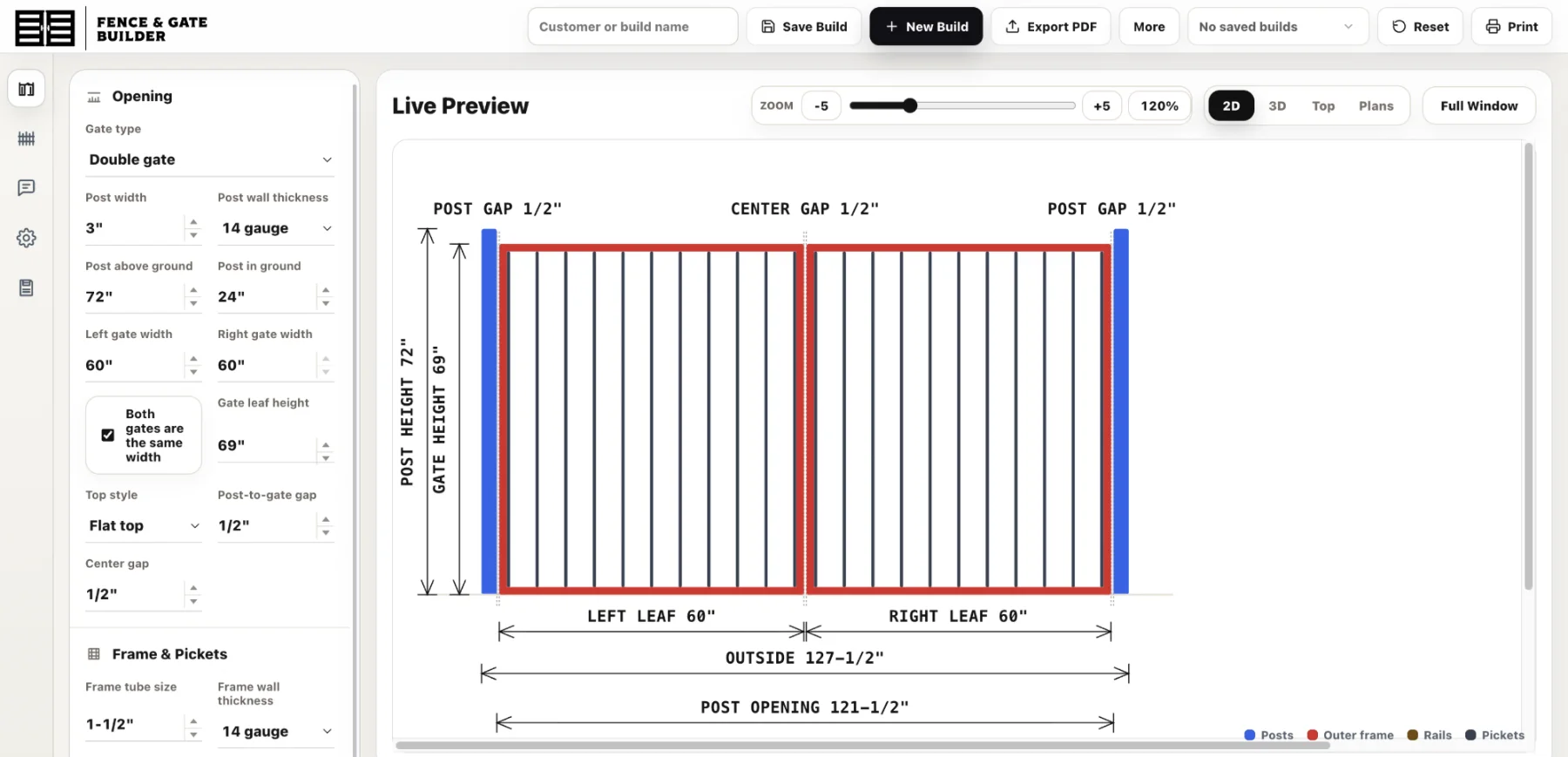
Fence & Gate Builder
A steel gate configurator with a live drawing and complete takeoff.
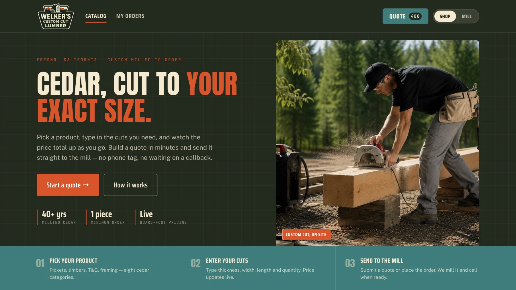
Welker's Custom Cut Lumber
A live board-foot quoting platform for custom-milled cedar.
Tell us what's slowing your team down.
Send us a note. We'll show you what a system built around your business could look like — no obligation, no jargon.