Senior portraits, sold like the art they are.
Shalem's senior portraits are genuinely editorial — mountaintop panoramas at golden hour, downtown black-and-whites, graffiti-wall color. But photography websites bury that work in identical thumbnail grids, and seniors book on feeling, not folders.
View project preview ↗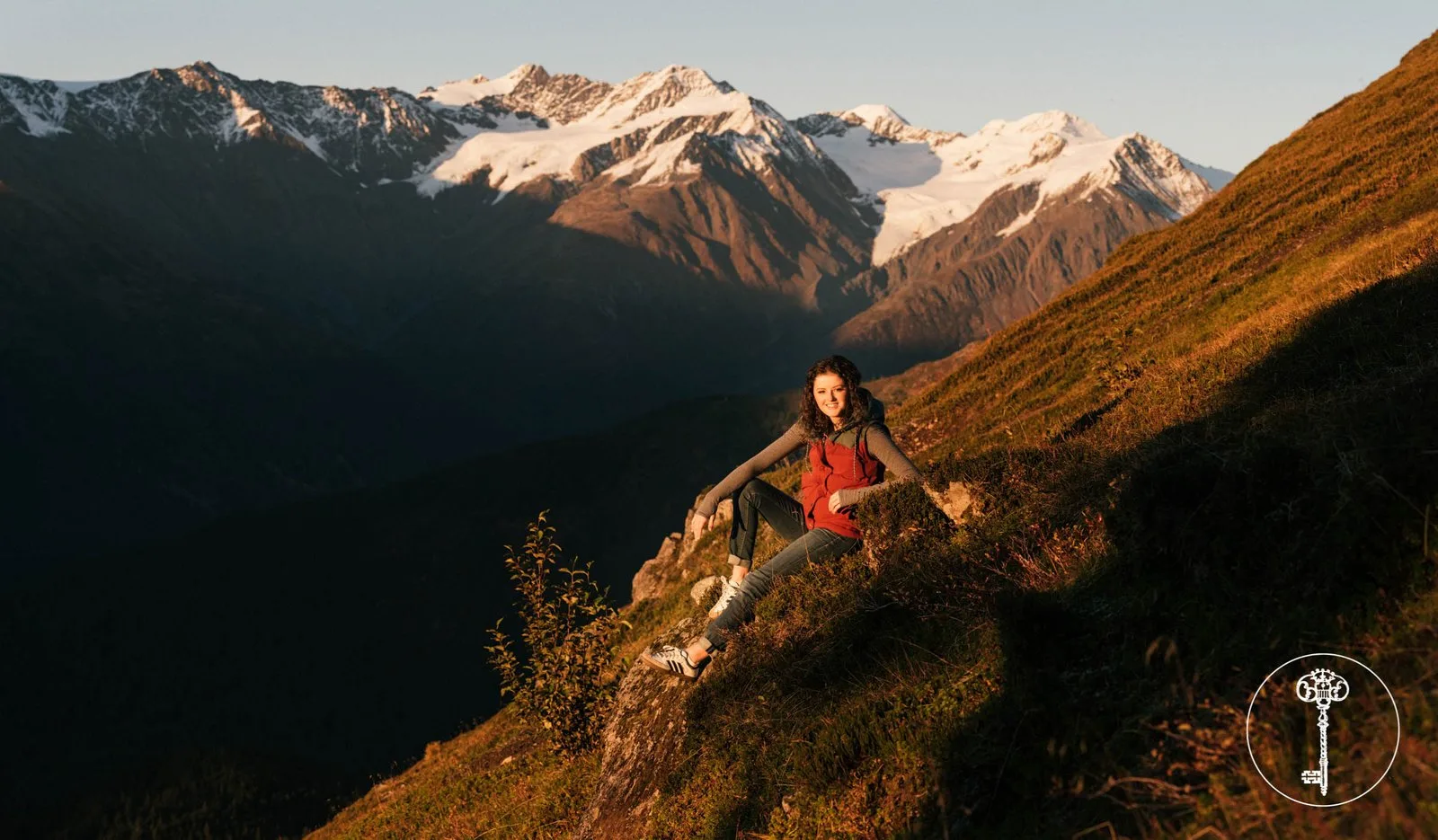
One site, every screen.
Both frames are the real website — scroll inside each device to explore the full experience.
Desktop · scroll to explore
Mobile · scroll to explore
Seniors book on feeling, not folders.
The site had to sell an experience — "your senior year, on your terms" — and turn Class of 2027 browsing into booked consults.
An editorial magazine, not a grid.
Chapters — approach, style, gallery, booking — that read like a lookbook and let the photography breathe at full width. Three style lanes help every senior see themselves in the work: City sharp, Wild Alaska, Soft story. And Alaska itself is the co-star — "the most cinematic backyard in the country," something no Lower-48 studio can copy.
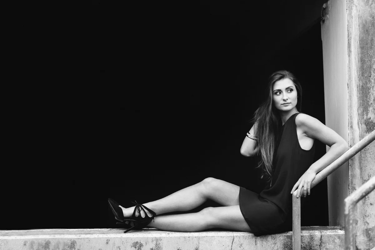
Color, texture, character.
Sessions designed around the person, not a preset. Graffiti walls, wardrobe, the small things — shot to feel like the senior, not the catalog.

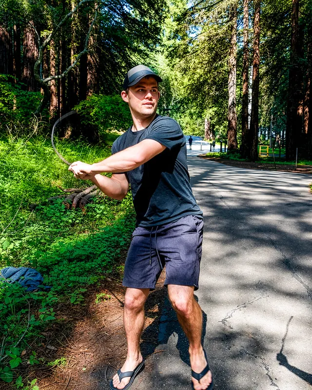
Brendan Collins
Brendan leads UI/UX, branding, and front-end execution — making software simple, clear, polished, and easy for real people to use.
On Shalem his focus was restraint: a design quiet enough to let world-class photography do the selling.
Does your website match the standard of your work?
Contact us →
Tell us what's slowing your team down.
Send us a note. We'll show you what a system built around your business could look like — no obligation, no jargon.