Slater Plumbing & Mechanical Website design, not yet launched
Seven directions.One built for the big jobs.Sevendirections. Onebuilt for thebig jobs.
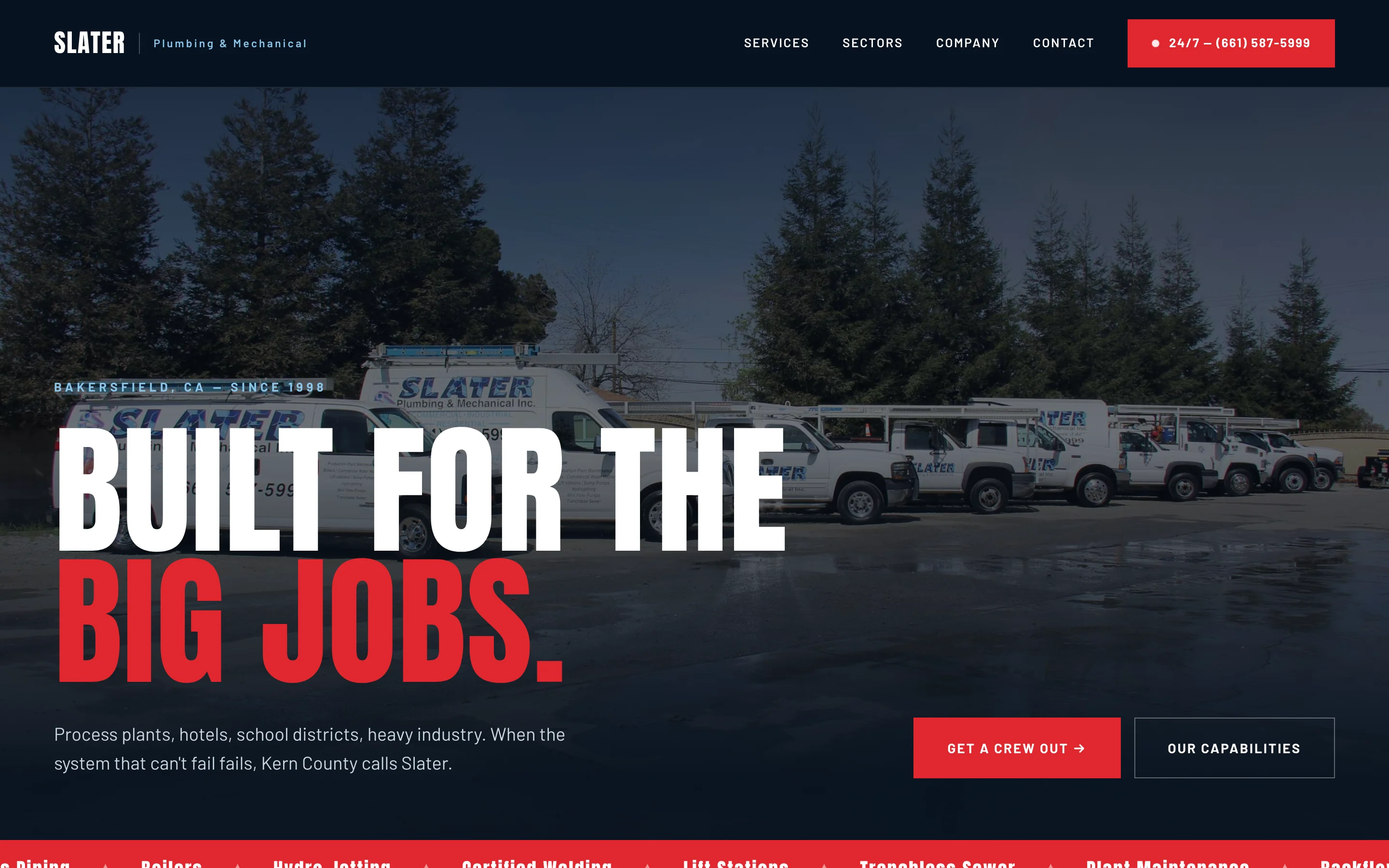
Collins Creative explored seven homepage directions for a Bakersfield plumbing and mechanical contractor, built three of them as working pages, and finished one as a responsive website organized around the company's five service divisions.
The website, interactive
The Heavy Industry
homepage, working.
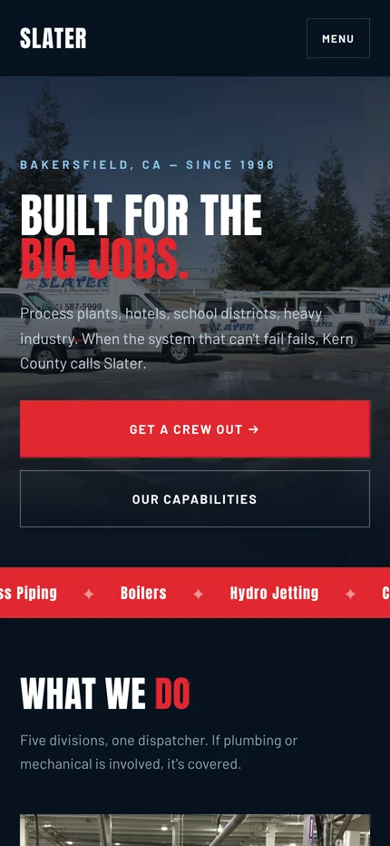
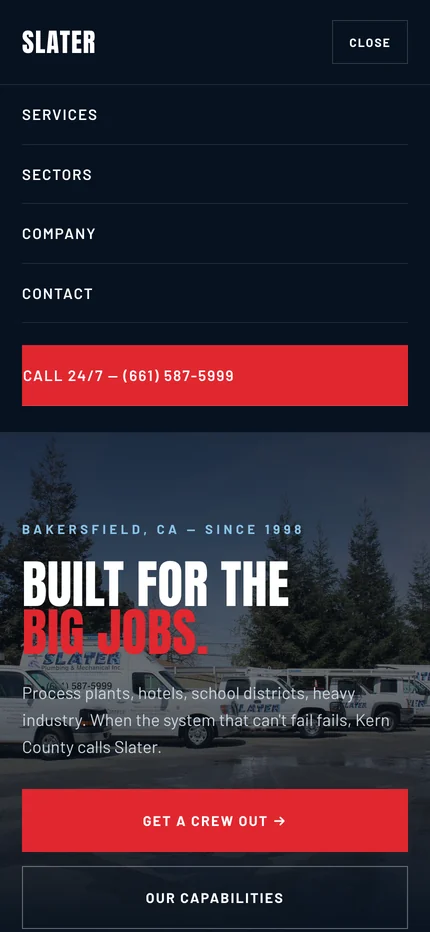
Scroll the Heavy Industry homepage on desktop or on a phone, jump between sections, and open the mobile menu.
Calls and email are switched off, and draft content that still needs the client’s confirmation, such as a review quote, is left out of this copy.
The directions we explored
Seven homepages,
side by side.
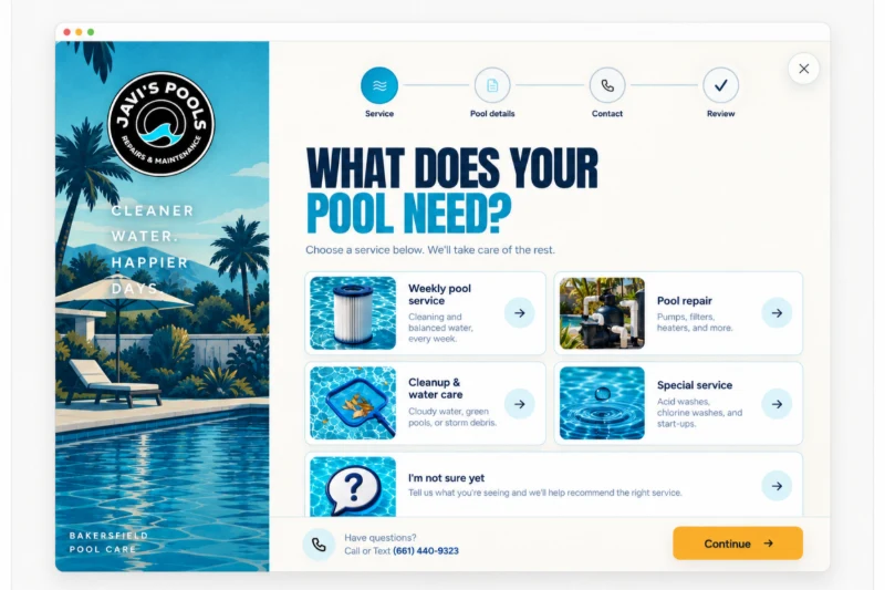
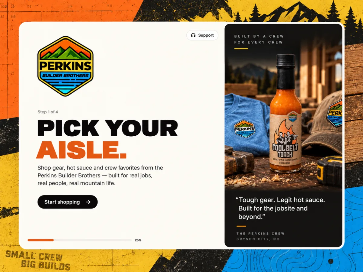
Before settling on a look, we built seven homepage directions, from a traditional service-company layout to a dark, fleet-led page aimed at large commercial work. Each one is a working page, so the comparison is between real layouts, not mood boards.
Captured from the finished design files, October 21, 2026
- Polished serviceApproachable and content-rich
- Commercial firstNavy, red, and the fleet up front
- Editorial mechanicalLighter, enterprise-style
- Refined typographyA new type pairing
- Blueprint precisionTechnical, for facility managers
- Heavy industryDark and direct, built in full
- Modern trade editorialWarm and human
What is left out This design has not launched, and slaterplumbing.com is a different website. The design files still hold draft content, such as a review quote and license details, that needs the client's confirmation, so those parts are left out of these screens and the interactive copy.
The challenge
One company, from a kitchen sink to a process plant.
Slater serves homes, hotels, school districts, and industrial plants. A homepage that leads with household repairs undersells the commercial work, and one that only talks to plant managers loses the homeowner.
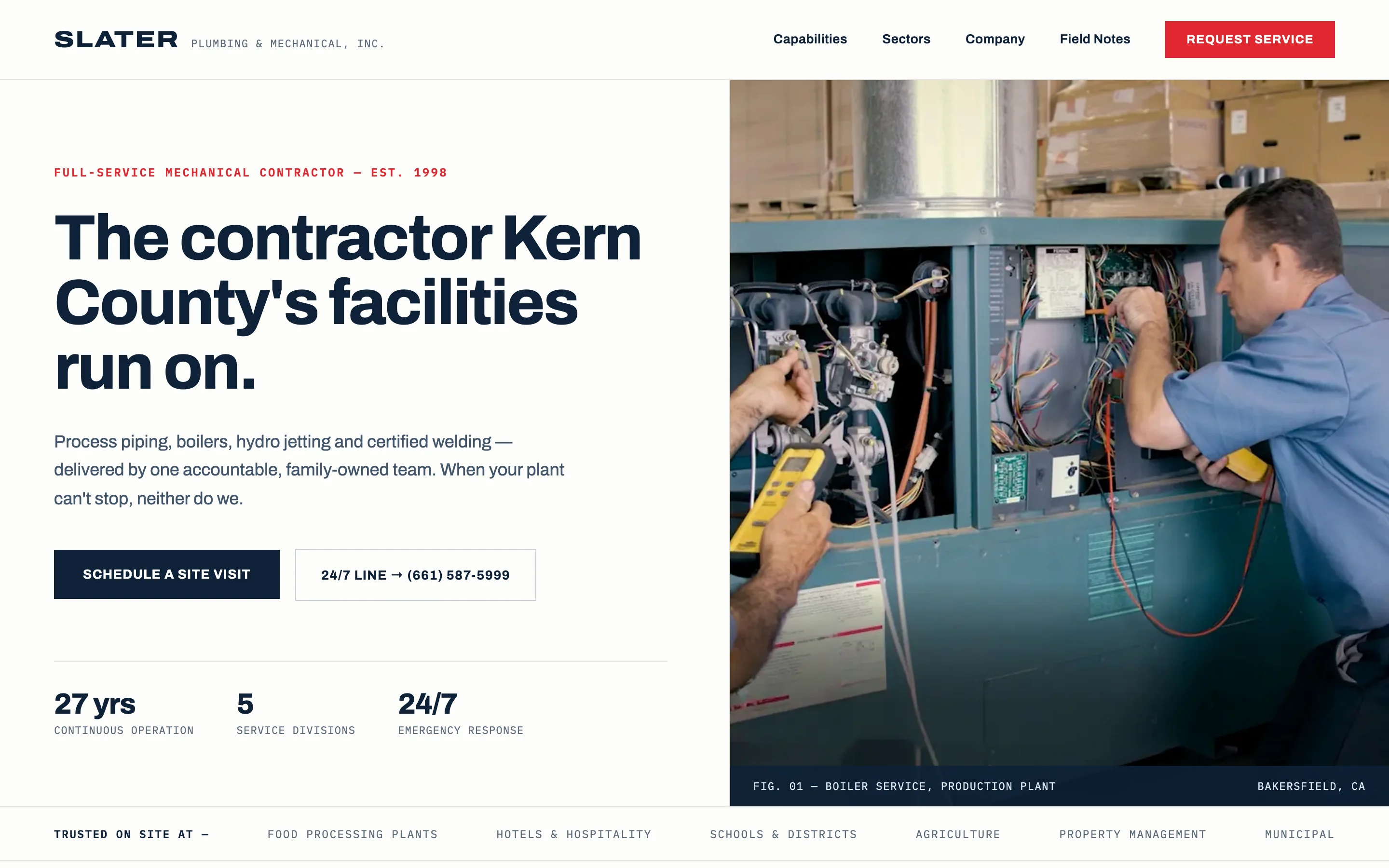
So we tested the balance in different directions. Blueprint precision, for example, speaks to facility managers with a technical, specification-style layout.
Three built directions
Same company.
Different voice.
Three directions were carried into finished pages so they could be compared at full size: Heavy industry, Blueprint precision, and Modern trade editorial. Heavy industry became the responsive site; the other two stay with it as desktop reference pages.
Warm, not corporate.

Call first, then the menu.
The responsive build
Five divisions
in one column.
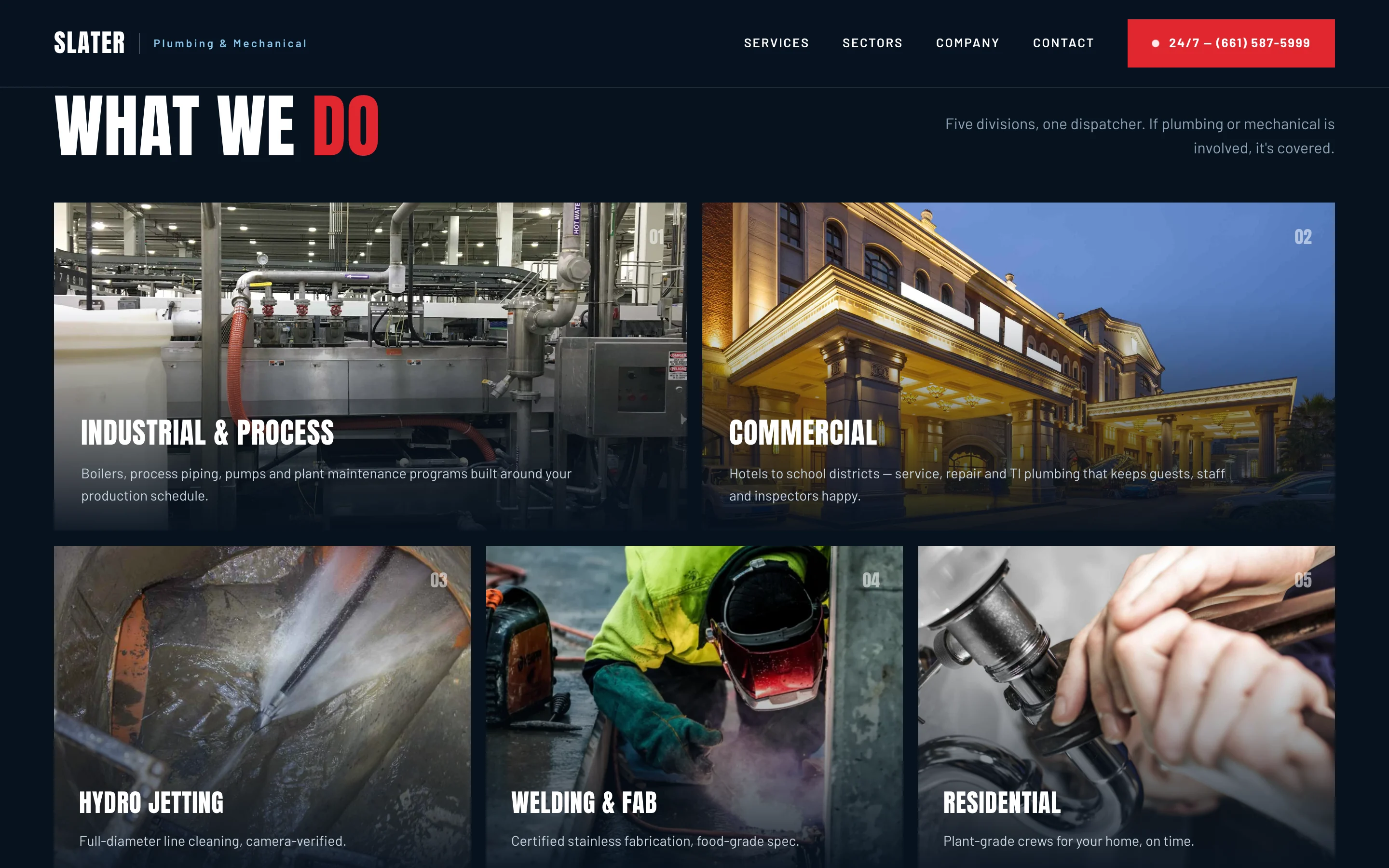
On a phone the division grid becomes a single column of tall photo cards, numbered in the same order as the desktop grid, each with one sentence on the work.
The site is plain HTML, CSS, and a small script for the menu and ticker, with reduced-motion support that stops the ticker.

What we made
From seven ideas
to one site.
Seven homepage directions
Working homepage versions that compare layout, type, color, and audience on real pages.
Heavy industry website
A responsive homepage with a capabilities ticker, the division grid, a company section, a call-first closing section, and a matching 404 page.
Two reference directions
Blueprint precision and Modern trade editorial, finished as full desktop pages for comparison.
Launch package
A static site with no build step, hosting settings, and a pre-launch checklist for the details the client still has to confirm.
Compare real pages,
then build one.

Project lead
Brendan Collins
Brendan led the design directions, the UX/UI of the finished homepage, and its front-end build.
The judgment that mattered was the order of the work on the page: put industrial and commercial first without losing the homeowner, and keep the phone number one tap away on every screen.
Meet the studioYour next chapter
Does your website show the size of jobs you take on?
If your best work is commercial but your website reads like a one-truck shop, we can test the directions with you and build the one that fits.
Start a project
More Collins Creative work