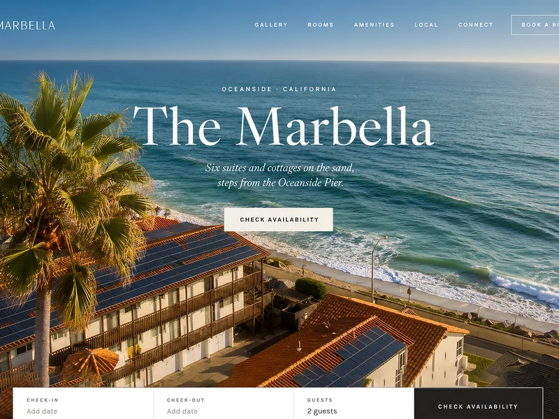
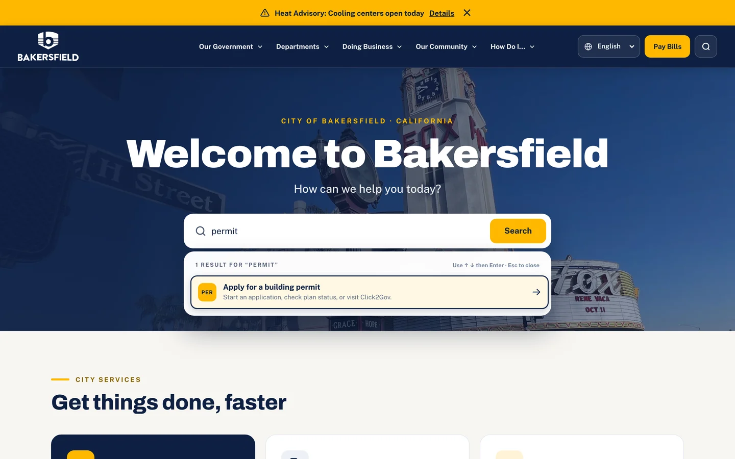
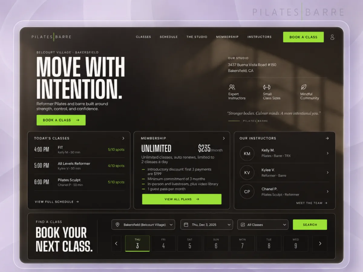
Mauricio's Grill & Cantina Working homepage prototype
Reserve, order, or call.Then stay a while.Reserve, order,or call. Thenstay a while.
Collins Creative designed and built a working homepage prototype for Mauricio's, a Bakersfield grill and cantina. It keeps the three actions a guest comes for on screen at all times, then makes the case for the kitchen, the cantina, and private events in the order a guest decides.
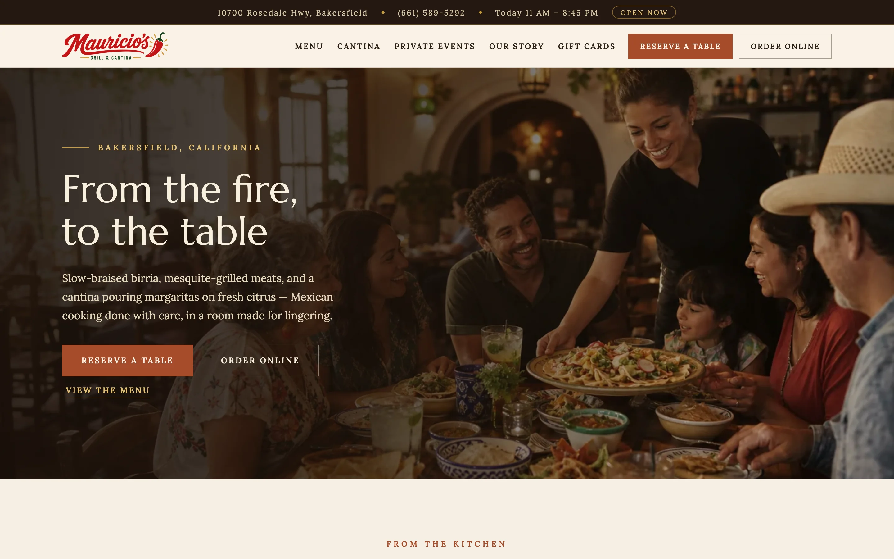
The prototype, interactive
One page,
start to finish.
Scroll the homepage, open the FAQ, and try the phone menu and its action bar.
In the prototype, Reserve and Order hand off to the restaurant's existing reservation and ordering pages. Those links and the call buttons are switched off in this preview.
The challenge
Hungry now, or planning ahead.
Some visitors want to order dinner in the next ten minutes. Others are choosing a place for a birthday, a rehearsal dinner, or a catering order, and want to know what the room and the bar are like first.
The prototype serves both on one page: the quick actions never leave the screen, and everything below them is there for the guest who is still deciding.
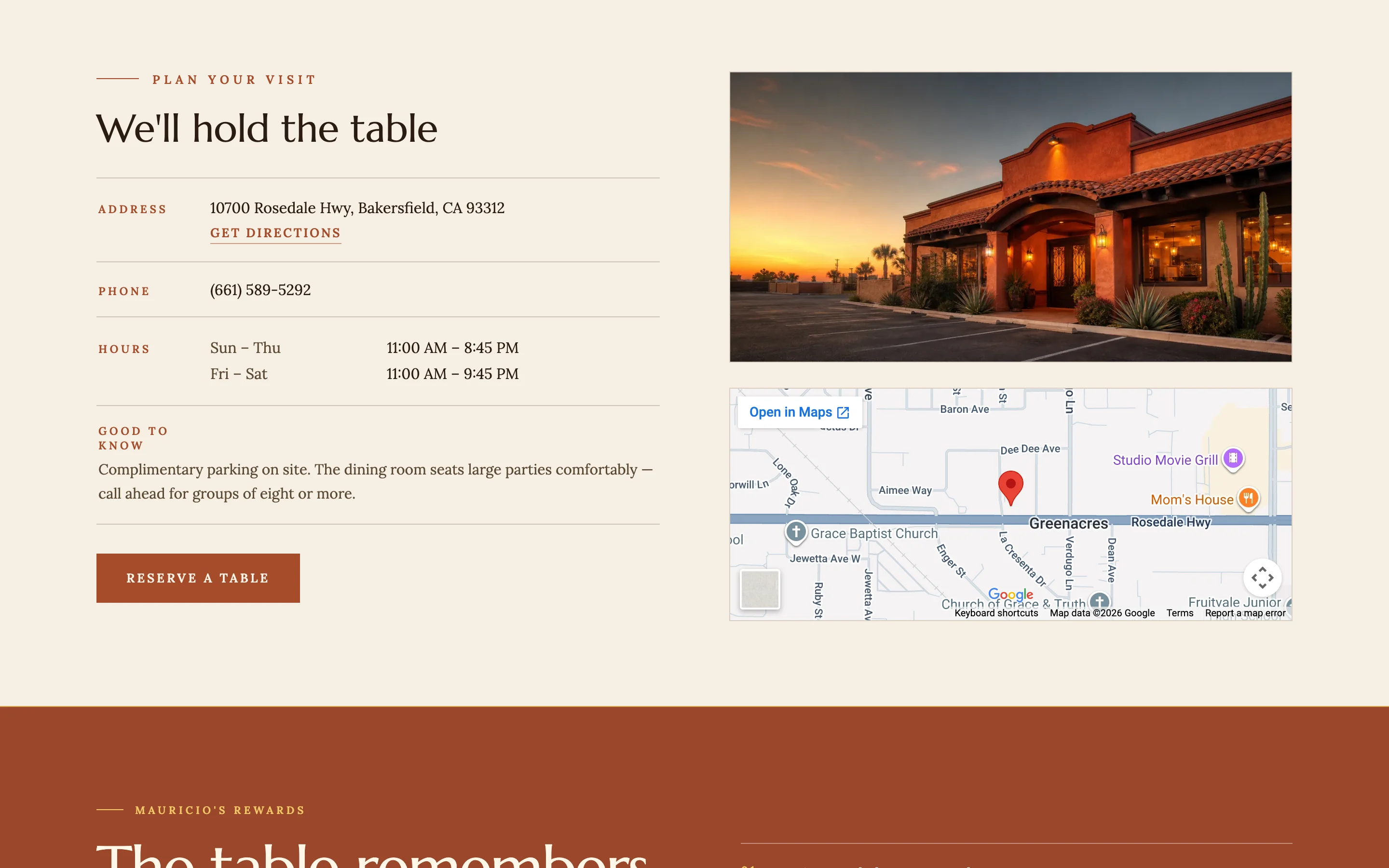
The homepage, in order
The order a guest
makes up their mind.
Below the hero, each section answers the next question a first-time guest has, from what to eat to where to park. The utility bar above it all shows today's hours and whether the restaurant is open now, worked out from the posted hours.
- KitchenFour signature plates with prices
- StoryWho cooks, and how
- CantinaThe margarita list and happy hour
- GatheringsPrivate dining and catering
- ReviewsGuest words, attributed
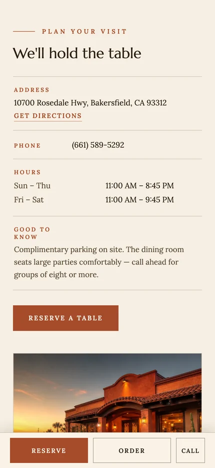
- VisitAddress, hours, parking, map
- RewardsWhat regulars get
- FAQReservations, events, takeout, hours
Events get their own door.
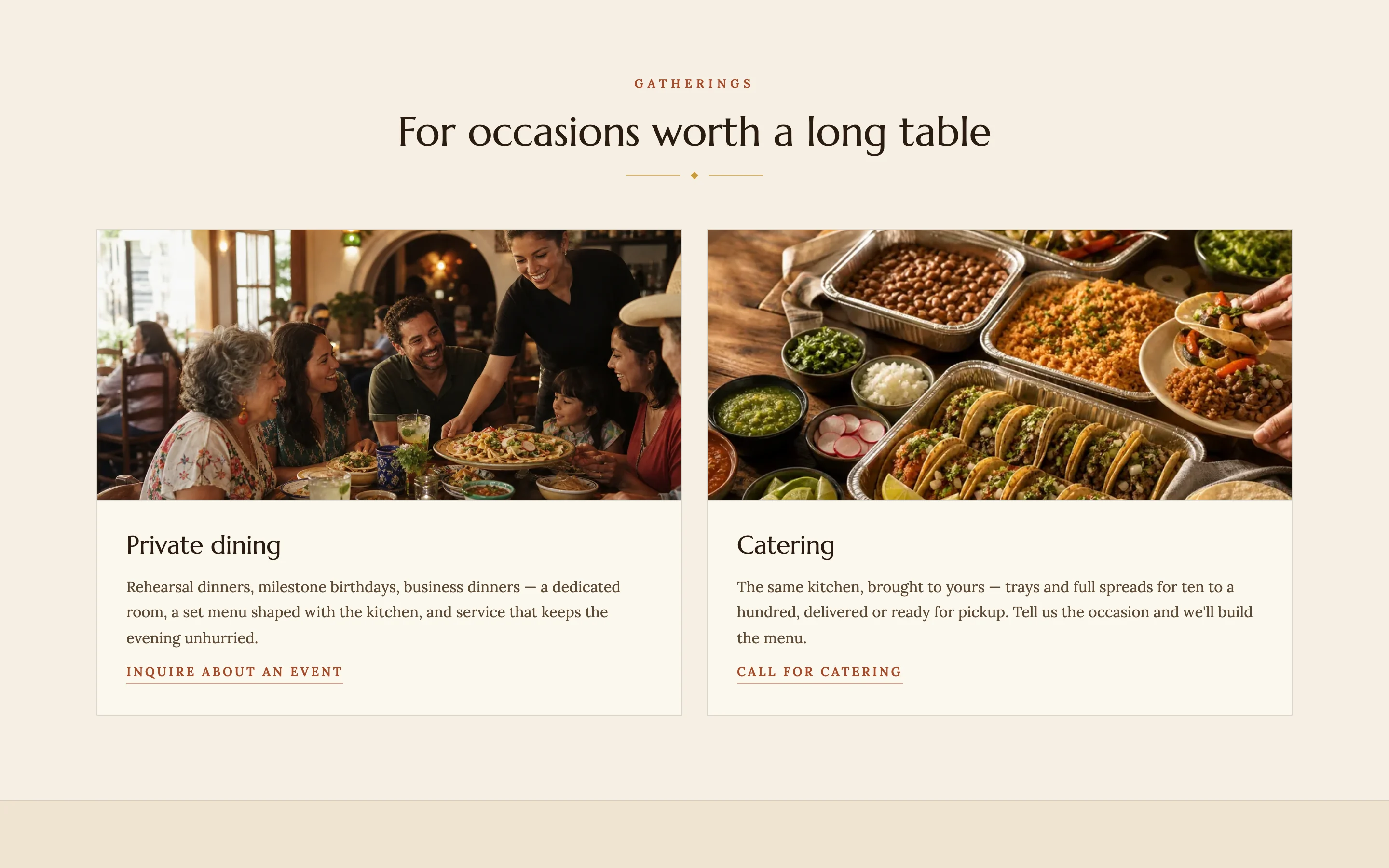
The visit, stacked.
About the imagery The food, room, and exterior photographs in the prototype are AI-generated concept images from the project's image library, not photographs of Mauricio's. They hold the place of real photography.
On a phone
Three buttons
that never scroll away.
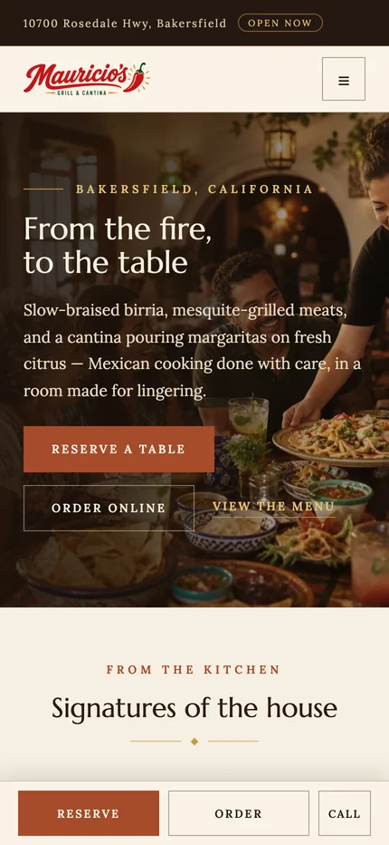
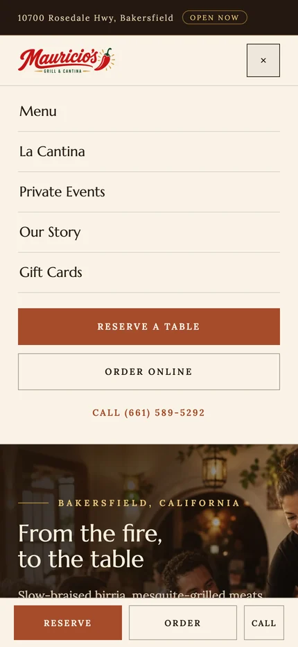
On a phone, Reserve, Order, and Call sit in a bar fixed to the bottom of the screen. Reserve gets the widest button and the brand color; Call is the narrowest.
The menu opens as a plain list of the five sections, followed by the same three actions in full width.
What we made
A homepage
that seats people.
Header and action bar
A utility bar with address, phone, and live open hours, a header with Reserve and Order, and a fixed Reserve, Order, and Call bar on phones.
Homepage sequence
Eight sections ordered by the questions a first-time guest asks, from signature plates to parking.
Event paths
Private dining and catering cards with their own inquiry and call actions, separate from tonight's order.
Art direction
An espresso, ember, and cream palette with a serif display face, and a concept image library to hold the place of real photography.
Keep the next step on screen.
Let the room do the rest.
Project lead
Brendan Collins
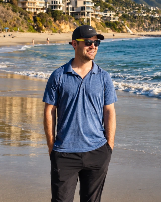
Brendan led the art direction, UX/UI design, and front-end build of the Mauricio's prototype.
The judgment that mattered was separating the quick decision from the slow one: three actions fixed on screen for the guest who is ready, and an ordered page for the guest planning a night out or an event.
Meet the studioYour next chapter
Is your menu
doing all the work?
If your website is a menu and a phone number, we can design a homepage that gets guests to a table, an order, or an event inquiry.
Start a projectMore Collins Creative work