Pacific Gate Works Website + guided inquiry
Built by hand.Sold with the same care.Built by hand.Sold withthe same care.
Collins Creative repositioned a custom cedar gate maker around one craftsman, one home, one made-to-order gate, then designed and built the editorial website, brand system, and eight-step inquiry that carry that idea from the first visit to Tom's inbox.
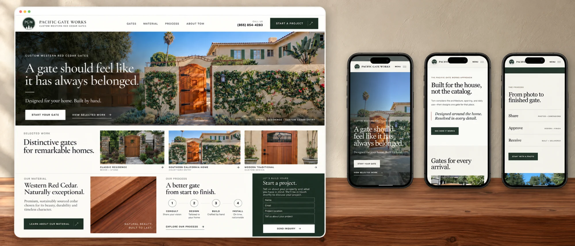
The finished website, interactive
One craftsman.
A clear way in.
This is the working site, not a mockup. Scroll the homepage, open the material and process pages, and step into the inquiry on desktop or on a phone. Forms are disabled inside the preview.
The challenge
Custom work can disappear inside catalog language.
Pacific Gate Works does not sell standard products. Tom designs each gate around the home's architecture, the opening, and the people who will use it every day. Gate makers online mostly look the same: grids of gates on white, spec sheets before a conversation.
The site had to make that difference obvious in one screen, without making the first step feel like ordering from a catalog or filling out a contractor form.
Brand + art direction
The work belongs
in the landscape.
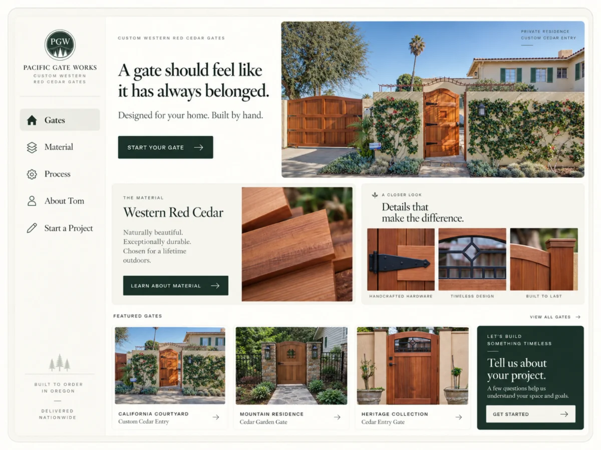
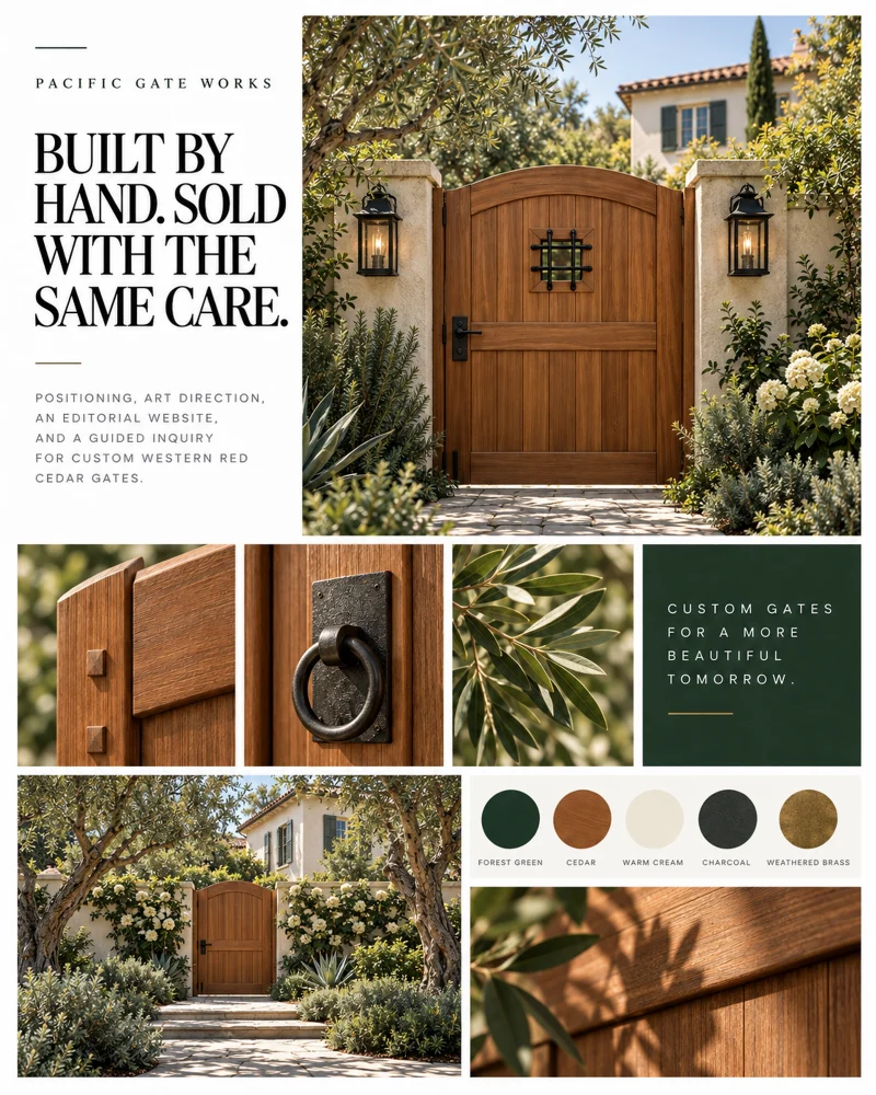
We built the visual system away from commodity home improvement. Large architectural photography, cream fields, deep evergreen, cedar and iron from the material itself, and a high-contrast serif set the pace of an interiors story while keeping a clear commercial path.
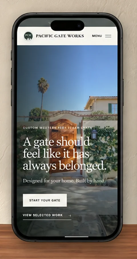
A gate should feel like it has always belonged.
Designed for your home. Built by hand. Every headline on the site is written to the homeowner, never to the trade.

PGW monogramThree cedars inside the ring, held to the same restraint as the site.
The conversion path
A photo is enough
to begin.
Instead of forcing a finished specification too early, we designed an eight-step inquiry that starts with the type of opening and gathers detail in calm stages. Tom gets useful project context; the homeowner's first move stays simple. A finished gate and a real client quote sit beside every step.
Start with the home.
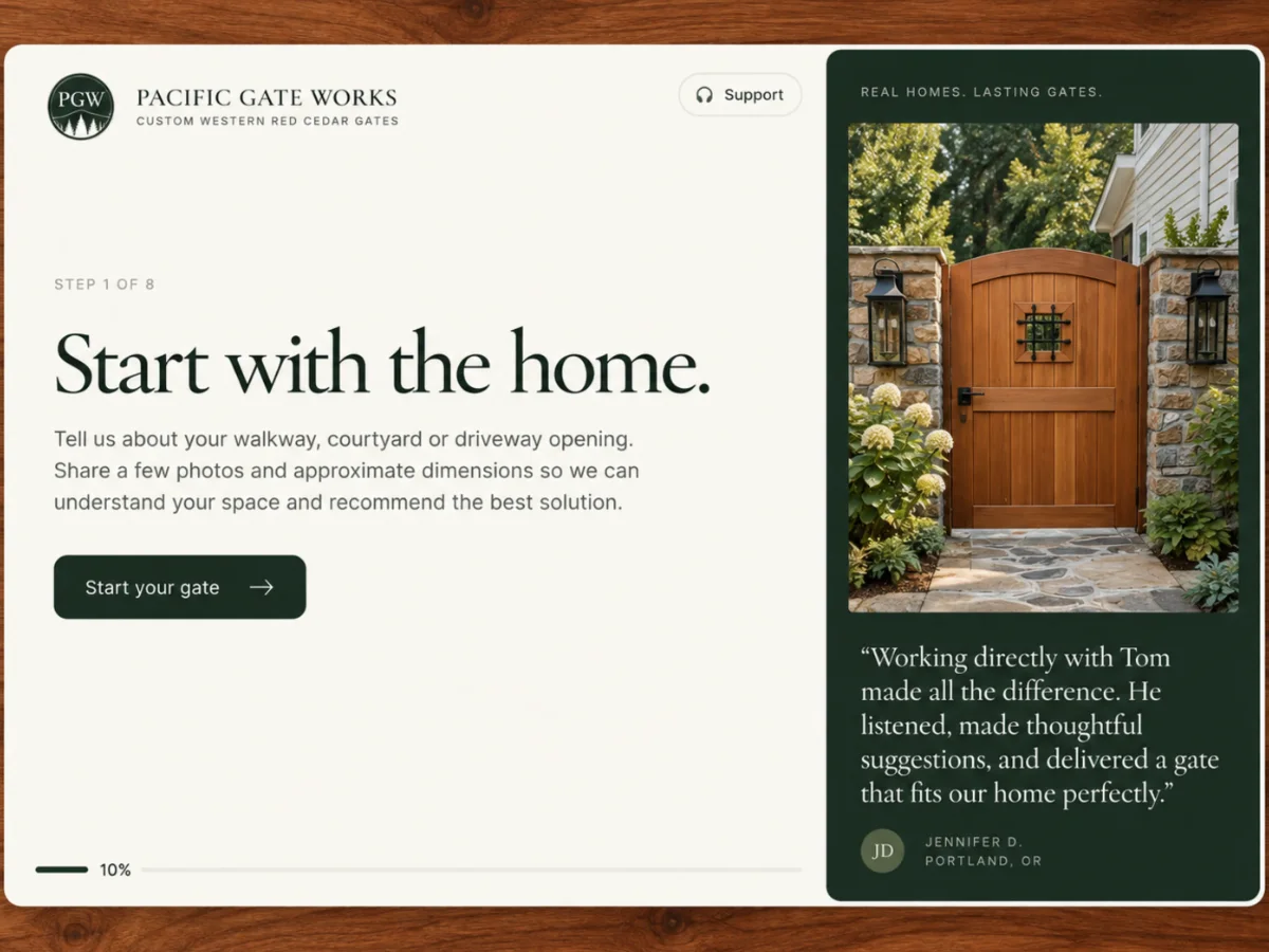
Share the place.
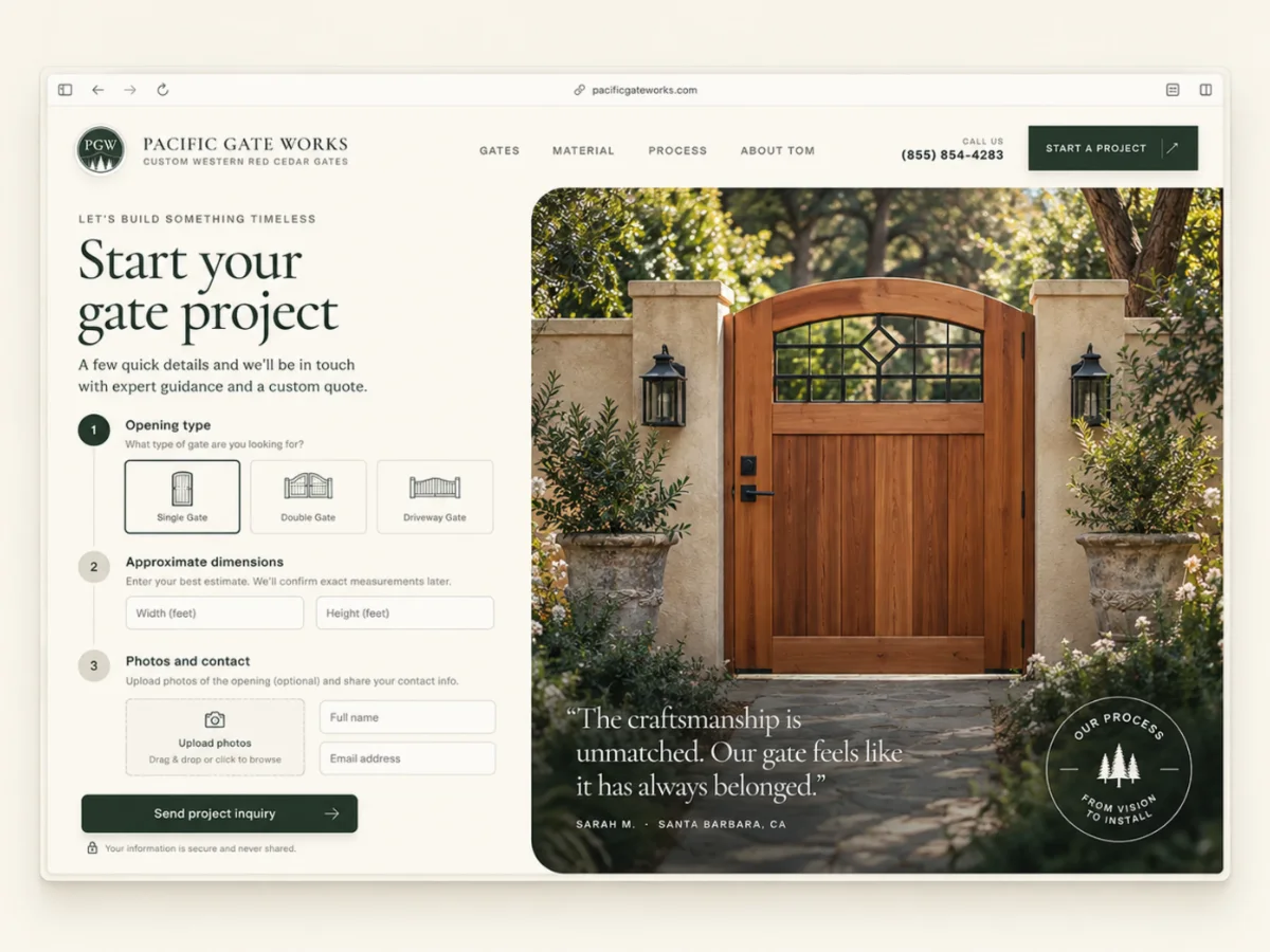
Name the opening
Single, double, or driveway sets the scale before anything else is asked.
Share the place
Photos, rough dimensions, finish preferences, and context guide the first recommendation.
Continue with Tom
The flow hands off to a direct craftsman relationship, not a sales queue.
Designed for the phone in your hand
The same calm,
one column wide.
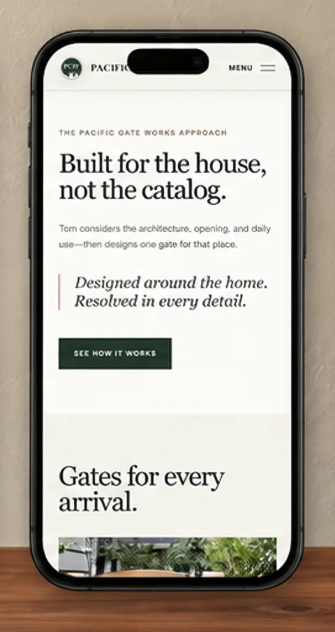
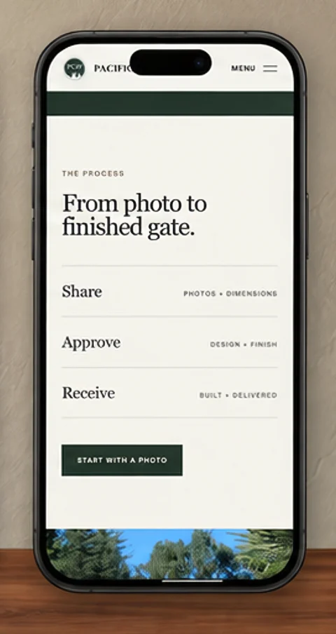
Most homeowners find a gate maker on a phone, standing at the opening they want to fill. We designed the mobile pages first: full-height photography, one headline, one action, and the process laid out as three plain steps.
Type, color, and the direct homeowner voice stay identical to the desktop site.
What we made
The idea,
all the way through.
Positioning + copy
Moved the story from product to fit: built for the house, not the catalog. Wrote every headline and page to the homeowner.
Brand system + art direction
Brand board, five-color palette, serif and grotesque pairing, photography direction, and the PGW monogram treatment.
Responsive website design + build
Homepage, gates, material, process, and About Tom pages, designed mobile-first and built as a fast, accessible static site.
Eight-step guided inquiry
Opening type, dimensions, photo upload, preferences, and contact, delivered to Tom as a usable project brief.
Less like a catalog.
More like an introduction.

Project lead
Brendan Collins
Brendan led positioning, brand, interface design, copy, and the front-end build. The work connects a first impression that feels like an interiors story with an inquiry that gives Tom what he needs to quote.
The central decision was restraint: let the architecture and the craft carry the emotion, then make the path to a real project personal and obvious.
Meet the studioYour next chapter
Something good
starts here.
Let's make the next thing your business needs. Thoughtfully designed. Built around you.
Start a project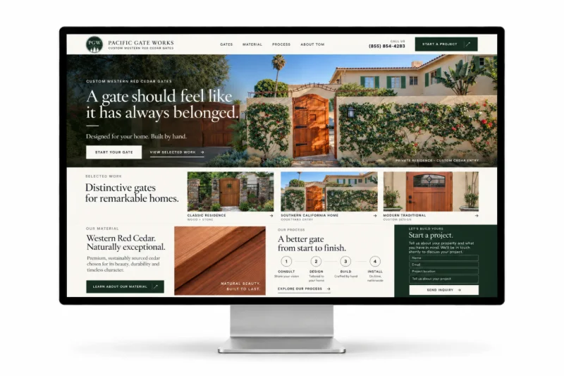
More Collins Creative work