California Resources Corporate website + homepage system
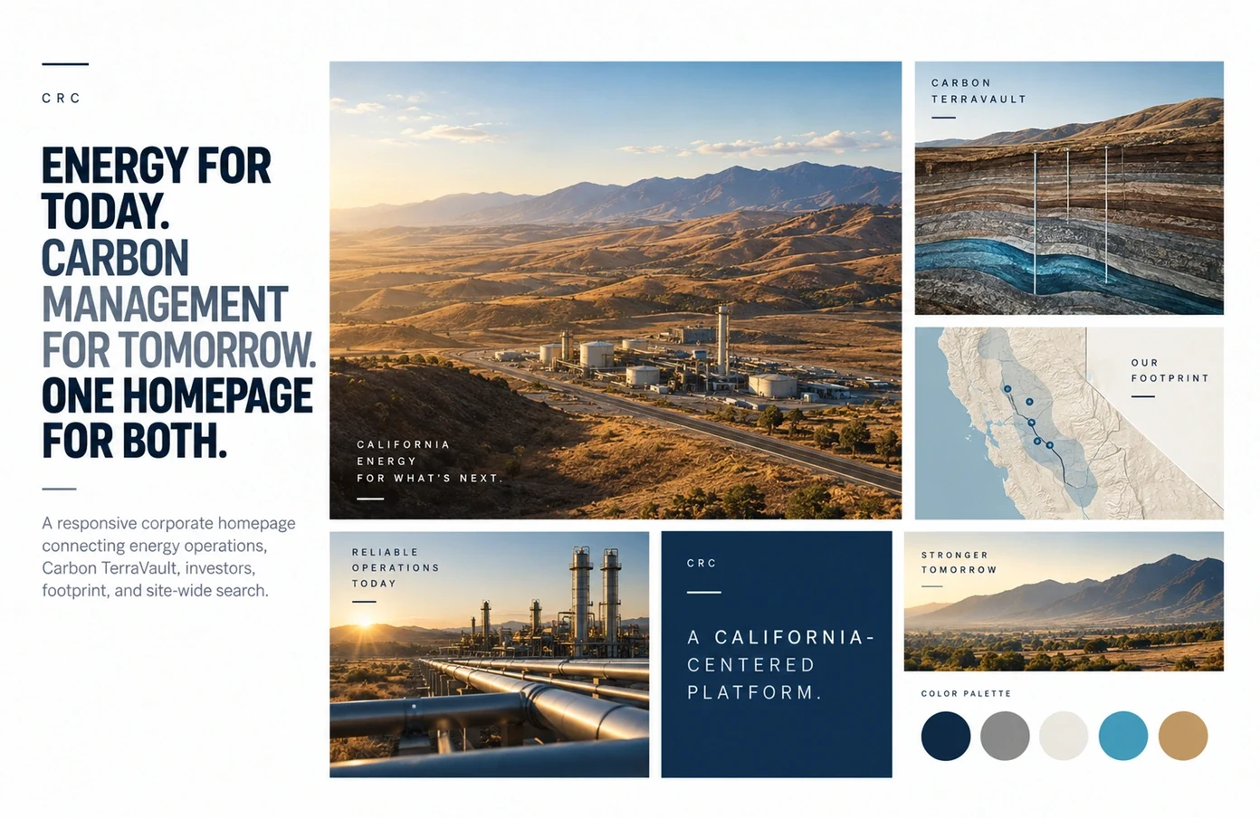
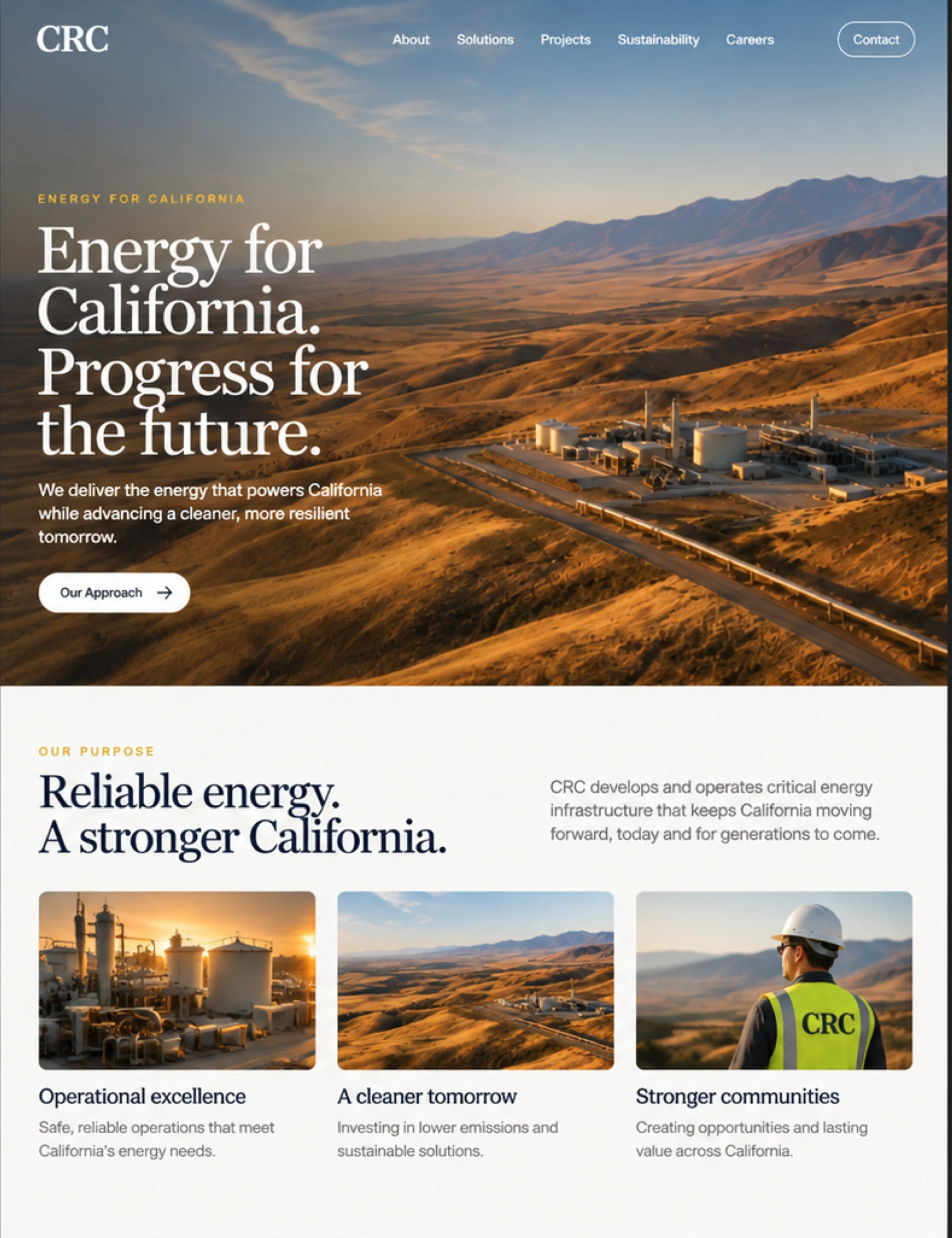
Energy for today. Carbon managementfor tomorrow. One homepage for both.Energy for today.Carbon managementfor tomorrow.One homepagefor both.
We designed and developed a responsive corporate homepage that connects CRC's established energy business, Carbon TerraVault growth platform, operating footprint, investor resources, and public information in one navigable system.
The challenge
Explain a complex platform without flattening the business.
CRC needed one corporate front door for two connected stories: an established energy business and a growing carbon-management platform. The homepage also had to serve investors, interest owners, partners, communities, and job seekers without turning into a wall of corporate navigation.
The work was to create clarity without removing depth. Each audience needed a direct route, while the page still had to explain how operations, infrastructure, geography, and Carbon TerraVault fit together.
Interaction design
Complex information, organized
around the questions people bring.
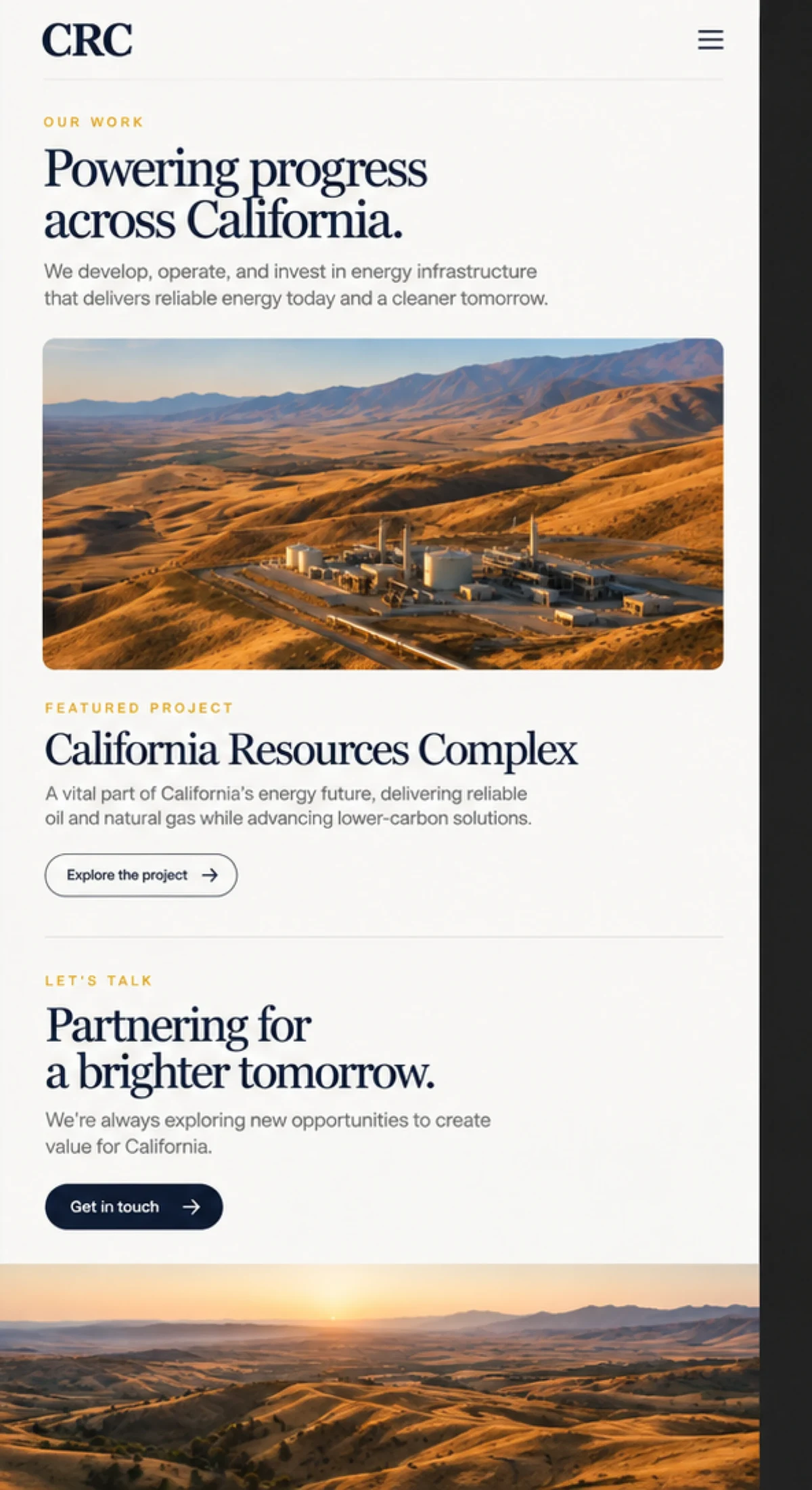
Search, operating regions, business stories, and responsive navigation share one visual and interaction system. The interface lets someone move from a broad corporate question to a specific place, project, resource, or next step without losing context.
What we built
A corporate homepage that works
like an information system.
Nine major sections follow a deliberate sequence: define the platform, locate the operations, explain the infrastructure, introduce Carbon TerraVault, then support sustainability, investor, news, and career paths.
- A four-scene hero that introduces the energy and carbon-management story through real operating landscapes.
- Structured desktop navigation, a scrollable mobile hierarchy, and a site-wide search layer.
- Interactive operating-region, infrastructure, and news controls that turn dense information into focused states.
- Responsive contact routing and audience paths for investors, interest owners, careers, and corporate inquiries.
The editorial system
Distinguish the two businesses
without splitting the brand.
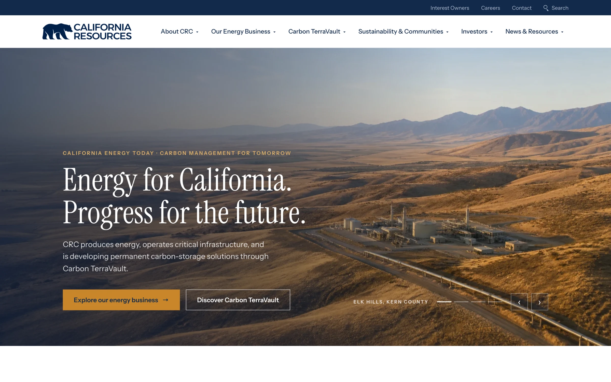
Deep navy, warm gold, field photography, and a high-contrast serif give the established energy story weight. Carbon TerraVault introduces a quieter green accent and proof-led structure, so the growth business feels distinct while remaining part of one CRC platform.
Energy for California. Progress for the future.
A high-contrast serif for the platform statement, a plain grotesque for the corporate detail, and tracked gold labels to name each chapter.
Clarity without removing depth.

Project lead
Brendan Collins
Brendan led the information architecture, UX/UI design, responsive system, and front-end build for the CRC homepage.
The central decision was sequence: define the platform first, locate the operations, explain the infrastructure, then introduce Carbon TerraVault, so every audience finds its route without the page becoming a directory.
Meet the studioYour next chapter
A complex business deserves
a clear front door.
Tell us who needs to find what. We will design the structure around it. No obligation, no jargon.
Start a projectMore Collins Creative work