NEFCO B2B e-commerce redesign
Twelve thousand SKUs.One calm homepage.Twelve thousandSKUs. One calmhomepage.
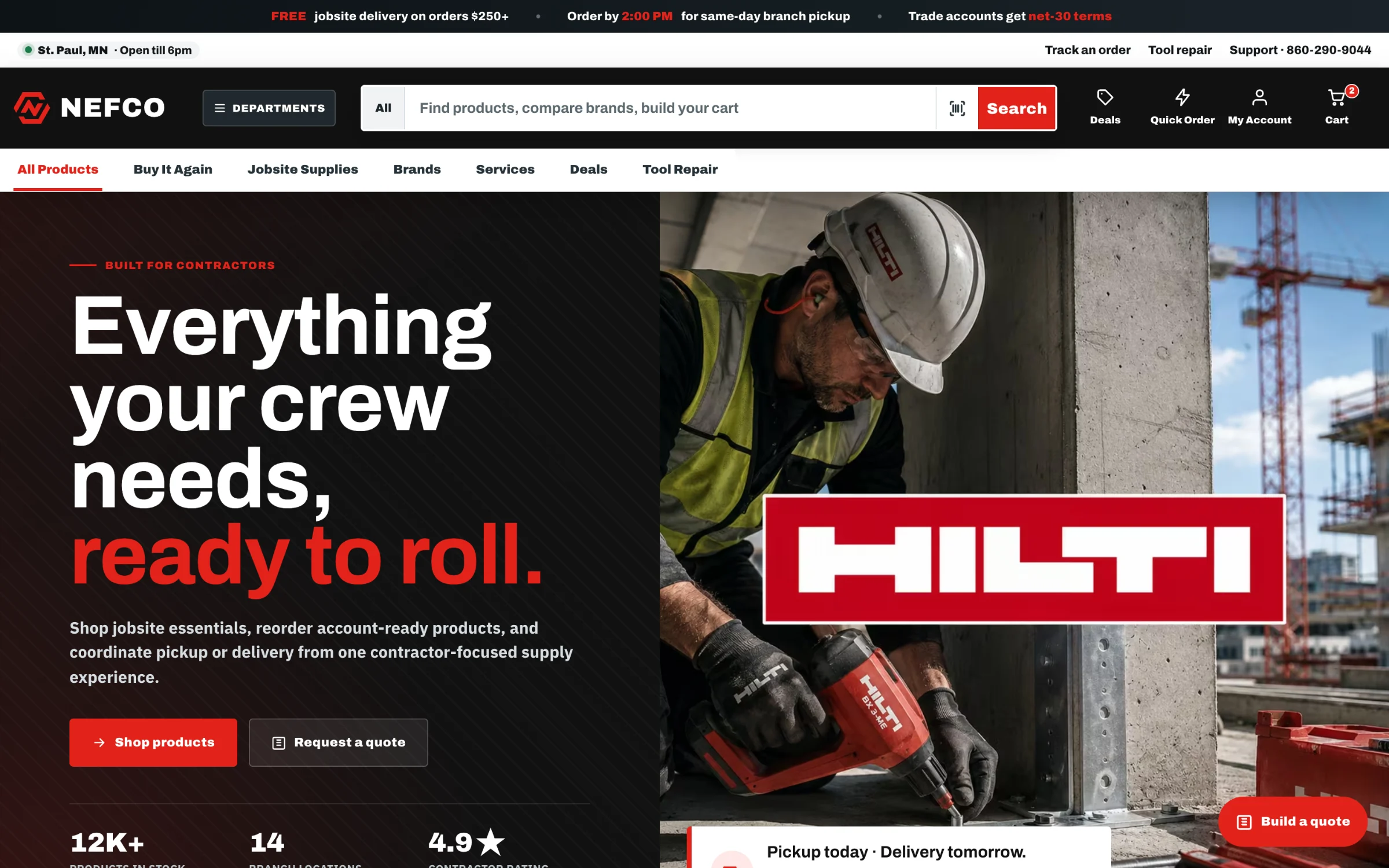
NEFCO is a family-owned construction supply distributor serving commercial jobsites from 70+ branches across the country. We reimagined their storefront, replacing a cluttered legacy site with a minimalist grid, a dark corporate palette, and a front end built around the way contractors actually buy: fast, repeat, and on a deadline.
The challenge
Contractors don't browse. They re-order at 6:45 AM.
NEFCO's buyers are foremen and purchasing managers with a crew on the clock. They know the SKU, they bought it last month, and they need it at the branch by this afternoon. The legacy homepage made them work for it: dense, cluttered, and organized around the catalog instead of the customer.
The brief we set ourselves: keep all of that inventory depth, but make the first screen feel like a tool, not a brochure. Strict hierarchy, generous whitespace, and the three jobs that matter (search it, re-order it, pick it up today) one action away.
The redesign
A strict grid that makes
dense data feel light.
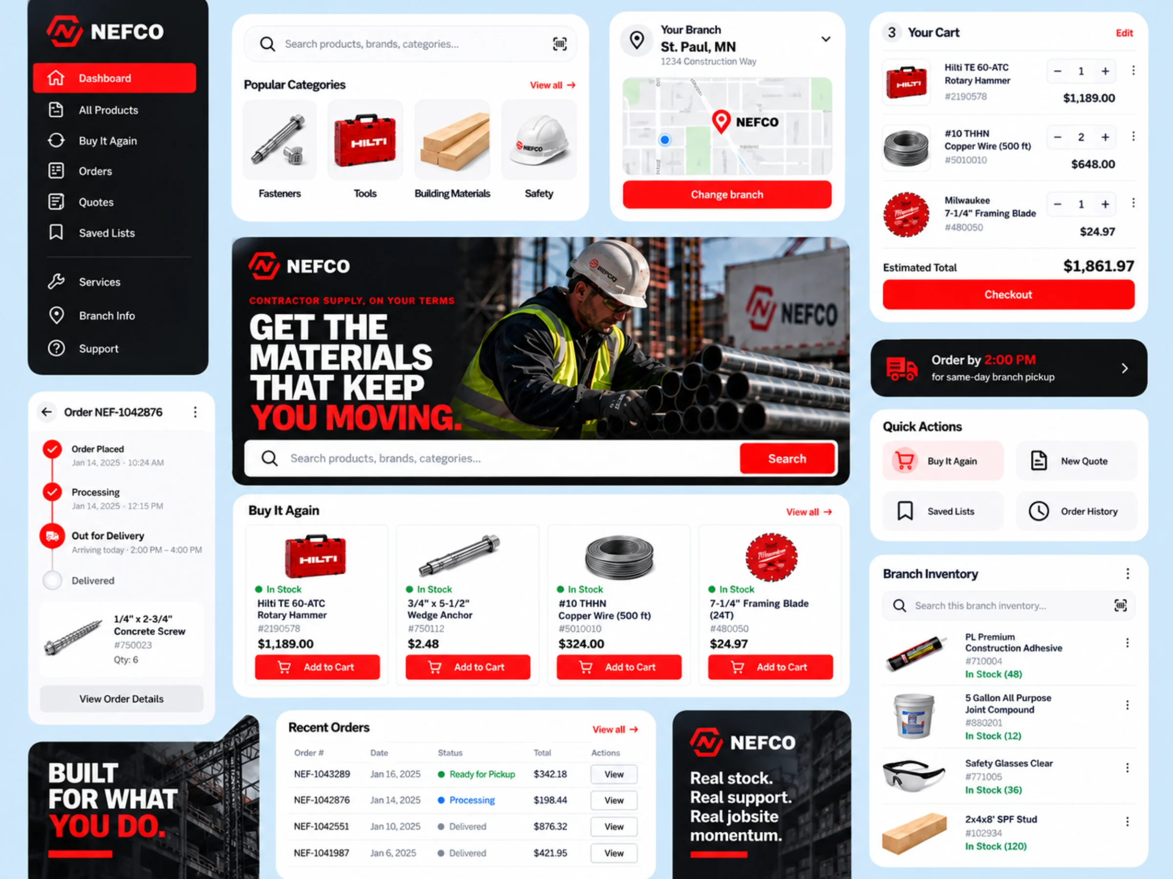
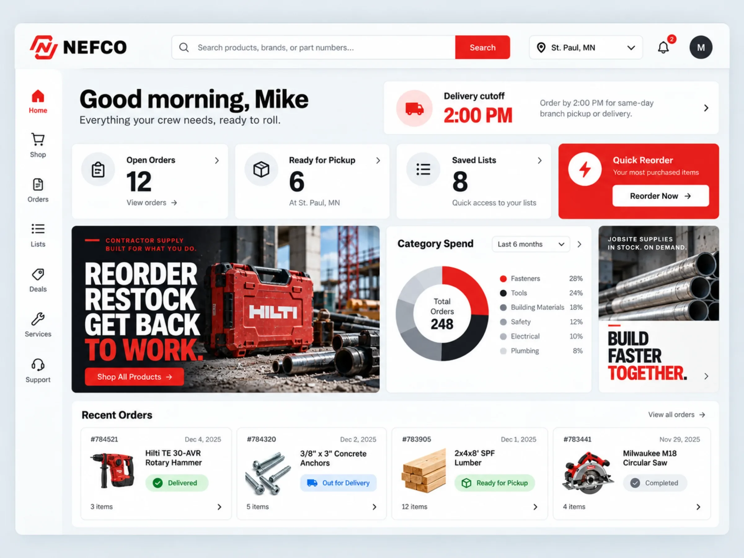
The new homepage runs on a modular grid with consistent margins and structured product cards. A dark corporate palette with one jobsite red gives the brand the weight of the equipment it sells, and leaves green for the only message that matters at the counter: in stock.
Everything your crew needs, ready to roll.
- Color-coded stock and shipping statuses. Green means go.
- Dynamic deal pricing with strike-through originals.
- Localized branch tracking. "St. Paul, MN · Open till 6pm."
- A live 2:00 PM countdown to the same-day pickup cutoff.
The signature build
A search bar that thinks
like a contractor.
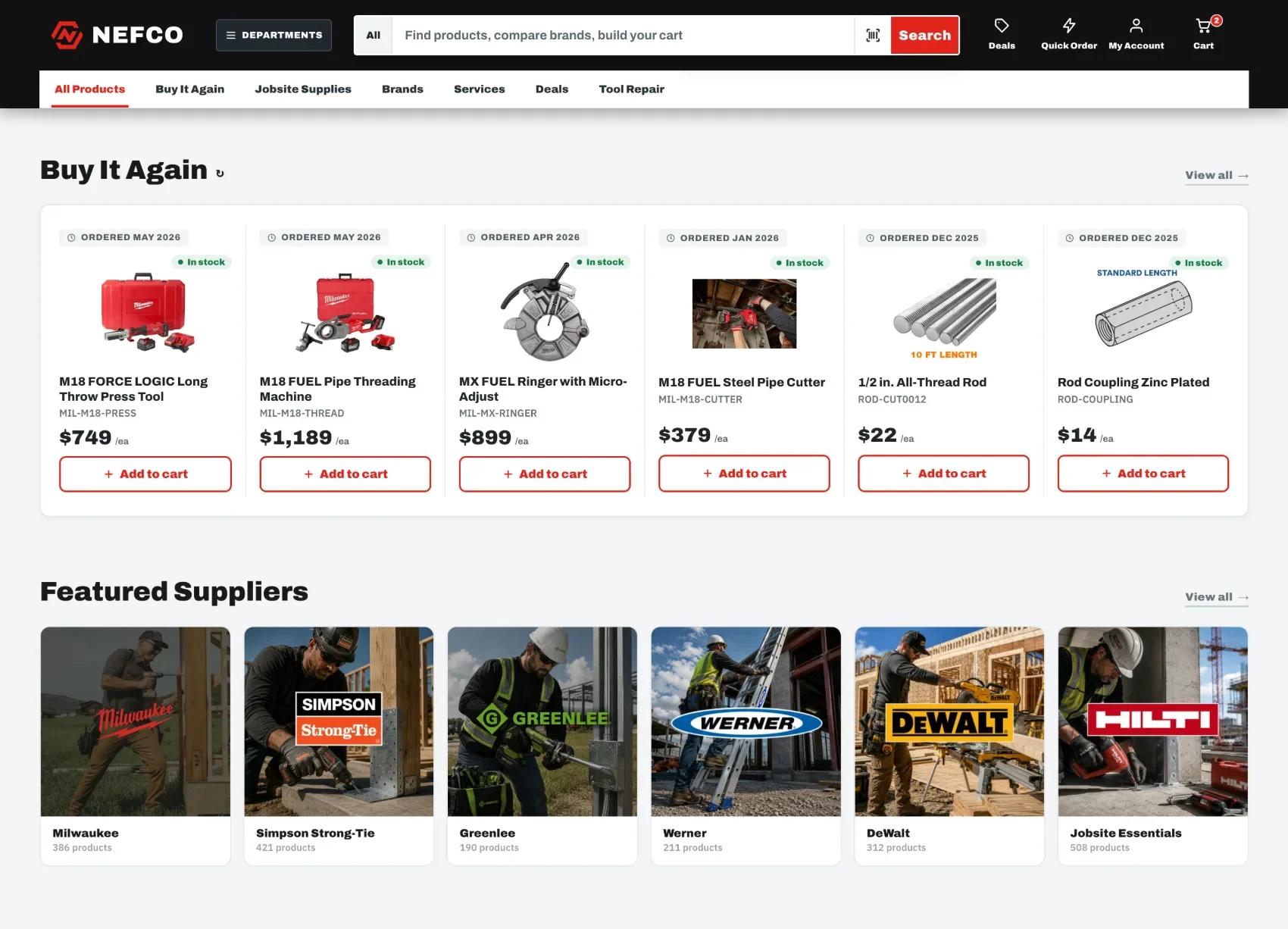
Search is the front door of a 12,000-SKU store, so we rebuilt it from scratch. One field, "Find products, compare brands, build your cart," opens a working command center: trending products, your recent searches, top categories with live counts, and suggested products showing price and real-time stock at your branch. There is even a barcode scan for the contractor standing in front of the empty box.
"Buy It Again." Reordering in one tap.
Pickup today, counted down.
In the truck
The whole counter,
one thumb.
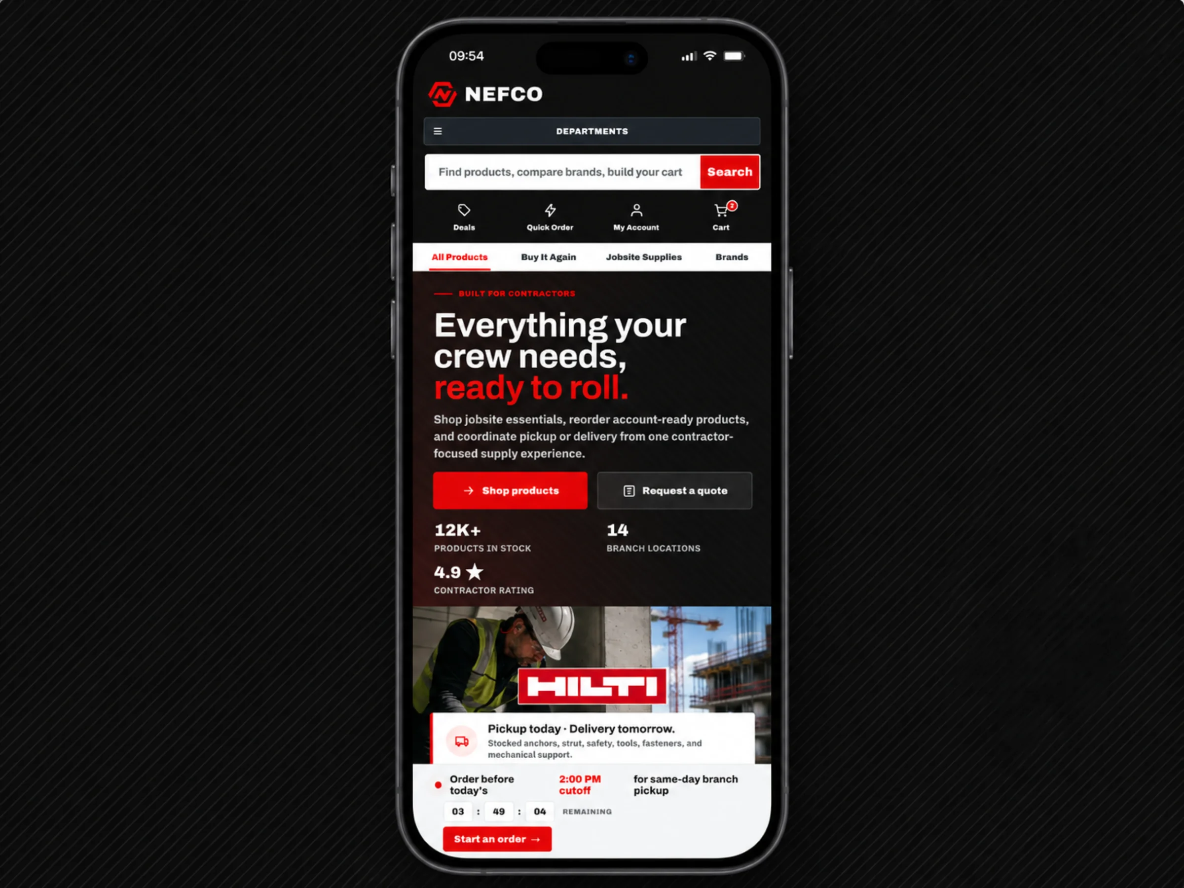
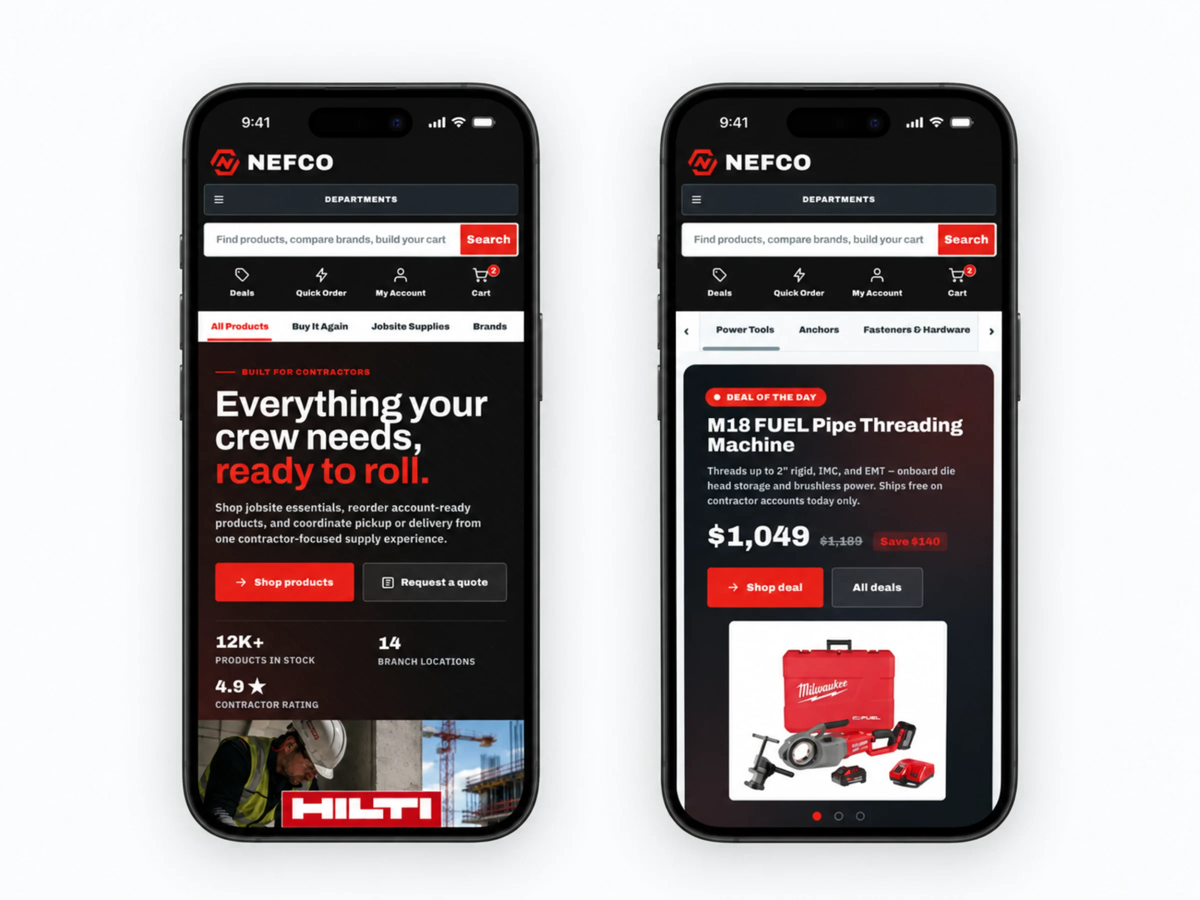
The mobile view keeps every promise of the desktop redesign: search up top, the branch tracker, the cutoff countdown, deals, and one-tap reordering, restacked for a foreman ordering from the cab between site checks.
What we made
Inventory depth,
without the clutter.
UX / UI redesign
Homepage, catalog, product cards, cart, and account dashboard rebuilt on one modular grid with strict hierarchy and generous whitespace.
Search experience
A single field that opens a command center: trending, recents, categories with live counts, suggested products with branch stock, and barcode scan.
Design system
Structured cards, color-coded stock and shipping statuses, deal pricing, branch tracking, and the live pickup countdown, documented for the build team.
Mobile views + performance
Every desktop promise restacked for the phone, with SEO and performance work so the first screen loads fast on a jobsite connection.
A tool, not a brochure.

Project lead
Brendan Collins
Brendan leads UI/UX, branding, and front-end execution, making software simple, clear, polished, and easy for real people to use.
On NEFCO his focus was discipline: a strict grid and typographic system that keeps twelve thousand SKUs scannable, and front-end logic that turns repeat buying into a single tap.
Meet the studioYour next chapter
Tell us what's slowing
your team down.
Send us a note. We'll show you what a system built around your business could look like. No obligation, no jargon.
Start a projectMore Collins Creative work