Perkins Builder Brothers E-commerce website + storefront
A storefront built likepart of the crew.A storefrontbuilt like partof the crew.
We led strategy, art direction, UX/UI, product storytelling, and front-end development for a custom ecommerce experience built in the crew's voice.
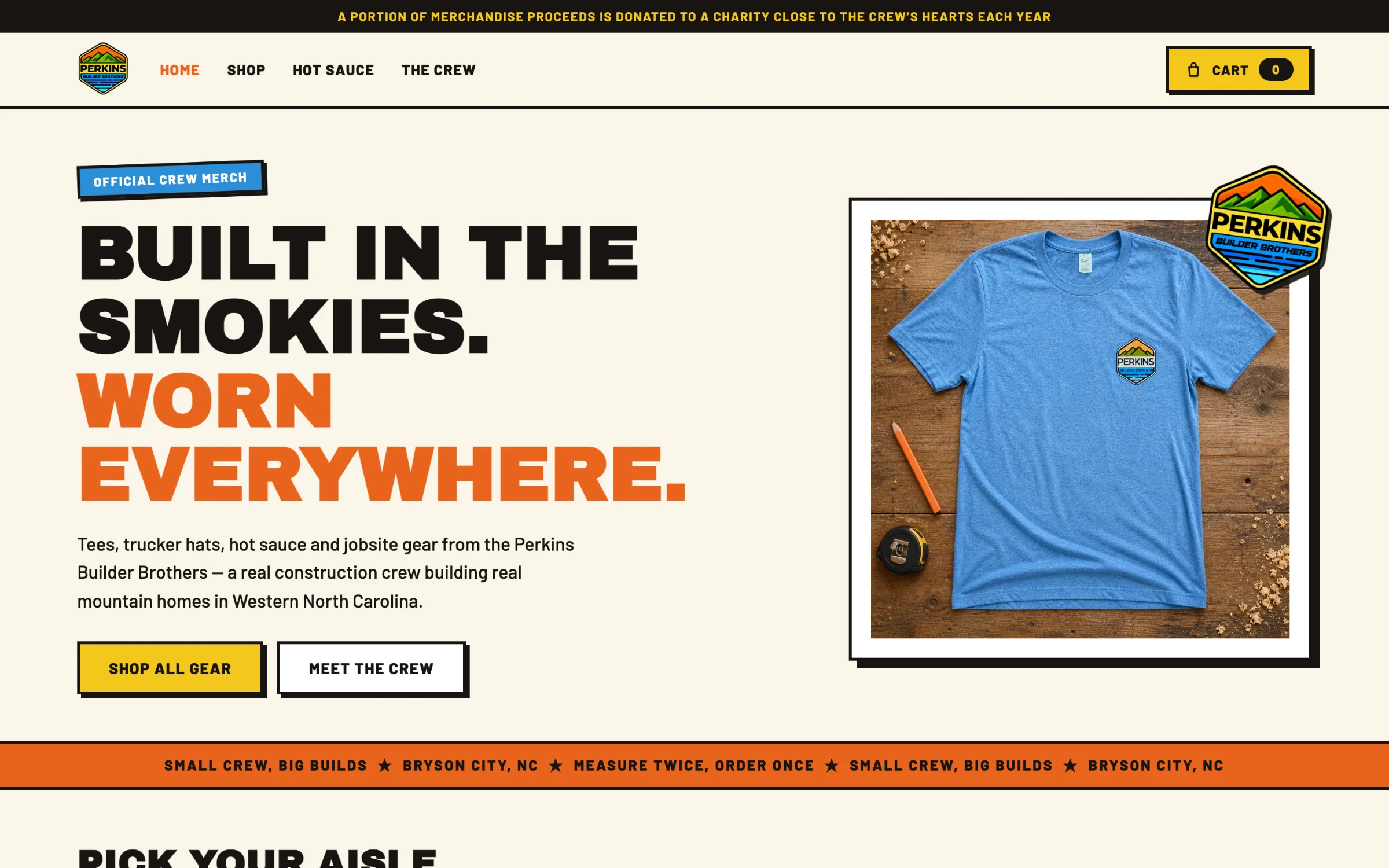
The finished storefront, interactive
The crew's store.
Try it.
This is the working store, not a mockup. Scroll the homepage, filter the catalog, open a product, and read the crew page on desktop or on a phone. Checkout is disabled inside the preview.
The challenge
Make a store feel like the crew, not a merch template.
Perkins Builder Brothers is a real construction crew building mountain homes in Western North Carolina, with an audience that follows the builds. Tees, trucker hats, hot sauce, and jobsite gear are how that audience joins in.
Our job was to translate the crew's bold, practical personality into a complete ecommerce system without sanding off what made the brand recognizable.
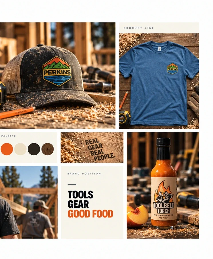
Strategy + art direction
Loud type. Honest photos.
A store that talks like the crew.
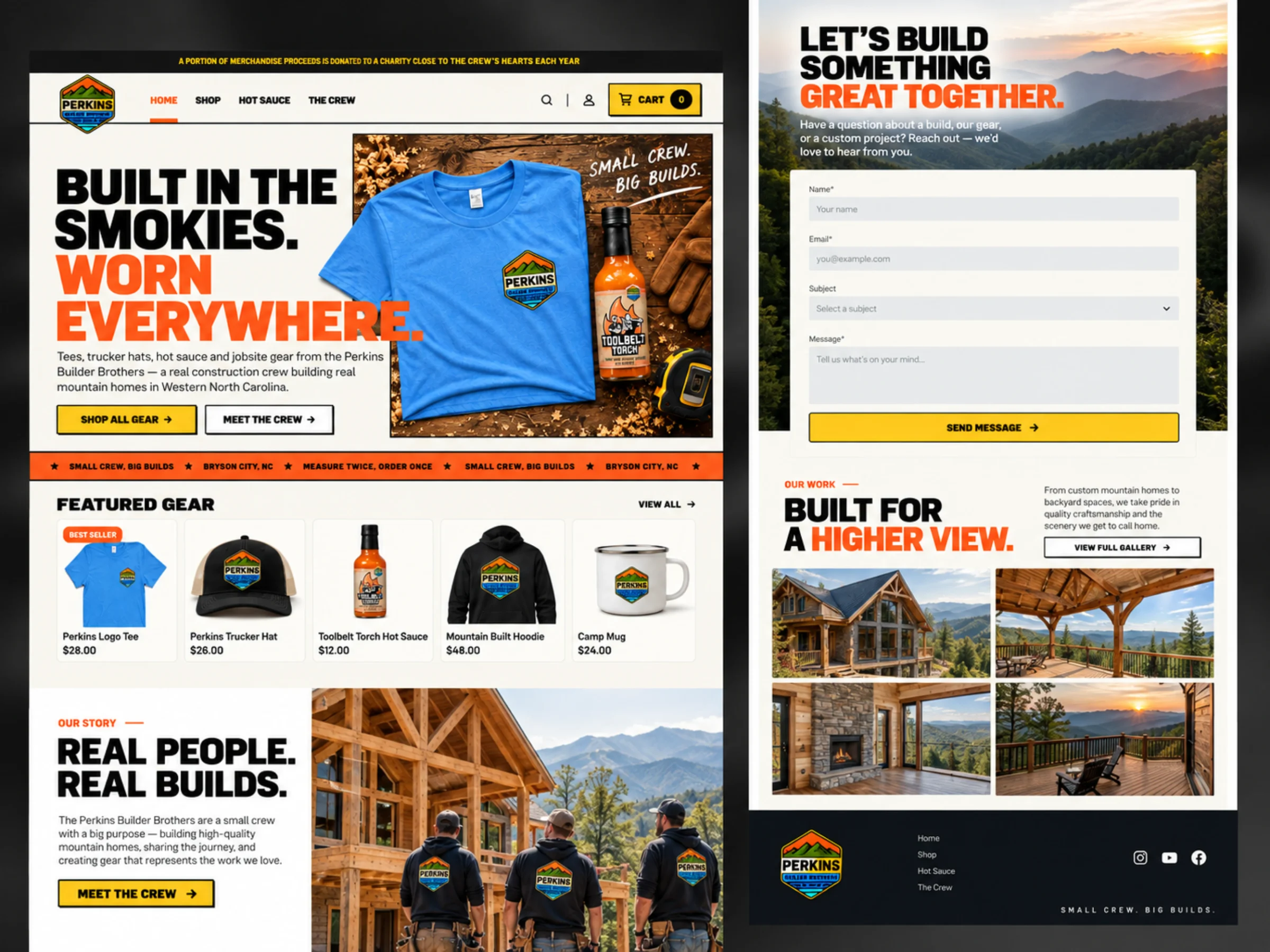
We shaped the storefront around how the crew's audience shops: a poster-scale headline, a clear aisle into gear, hot sauce, and the crew, and a cart action that is never more than one screen away. Heavy condensed type, hard drop shadows, and jobsite color carry the voice through navigation, catalog, and product pages.
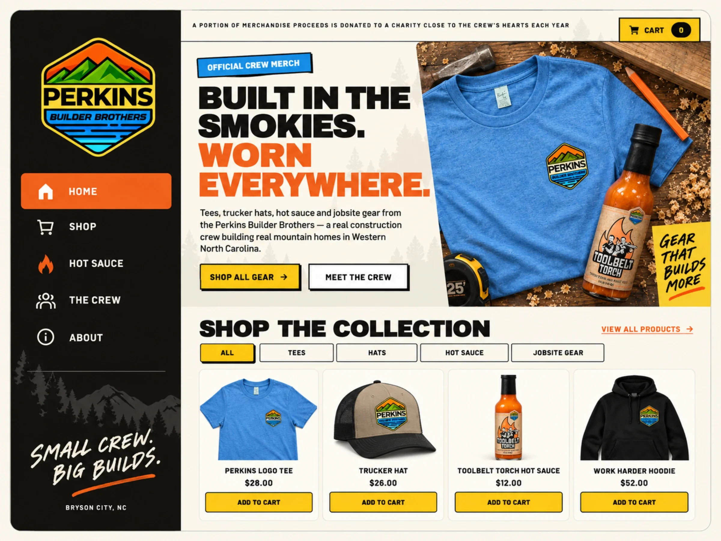
Built in the Smokies. Worn everywhere.
Small crew, big builds. Every headline on the site is written the way the crew talks on camera: short, direct, and a little proud.
What we built
A branded ecommerce system,
from strategy to cart.
Storefront strategy and content architecture, a visual system that carries the Perkins voice through every page, responsive UX that keeps browsing and cart actions clear, and dedicated hot sauce and crew stories that make the brand bigger than the product grid.
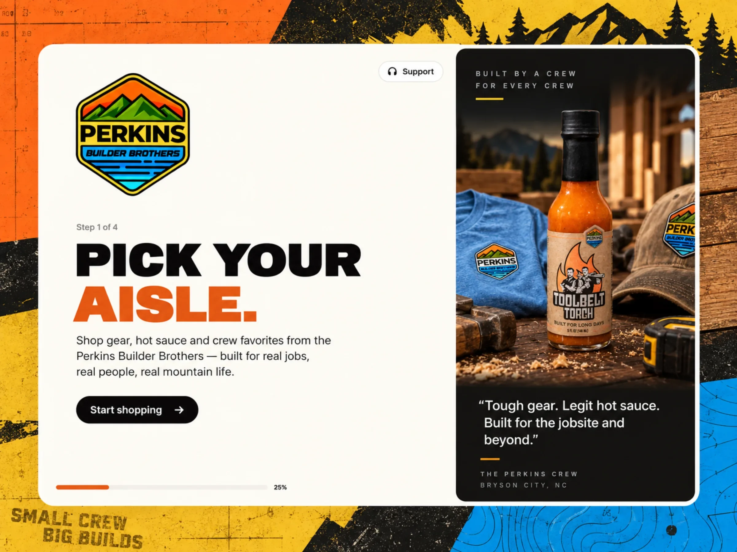
Pick your aisle.
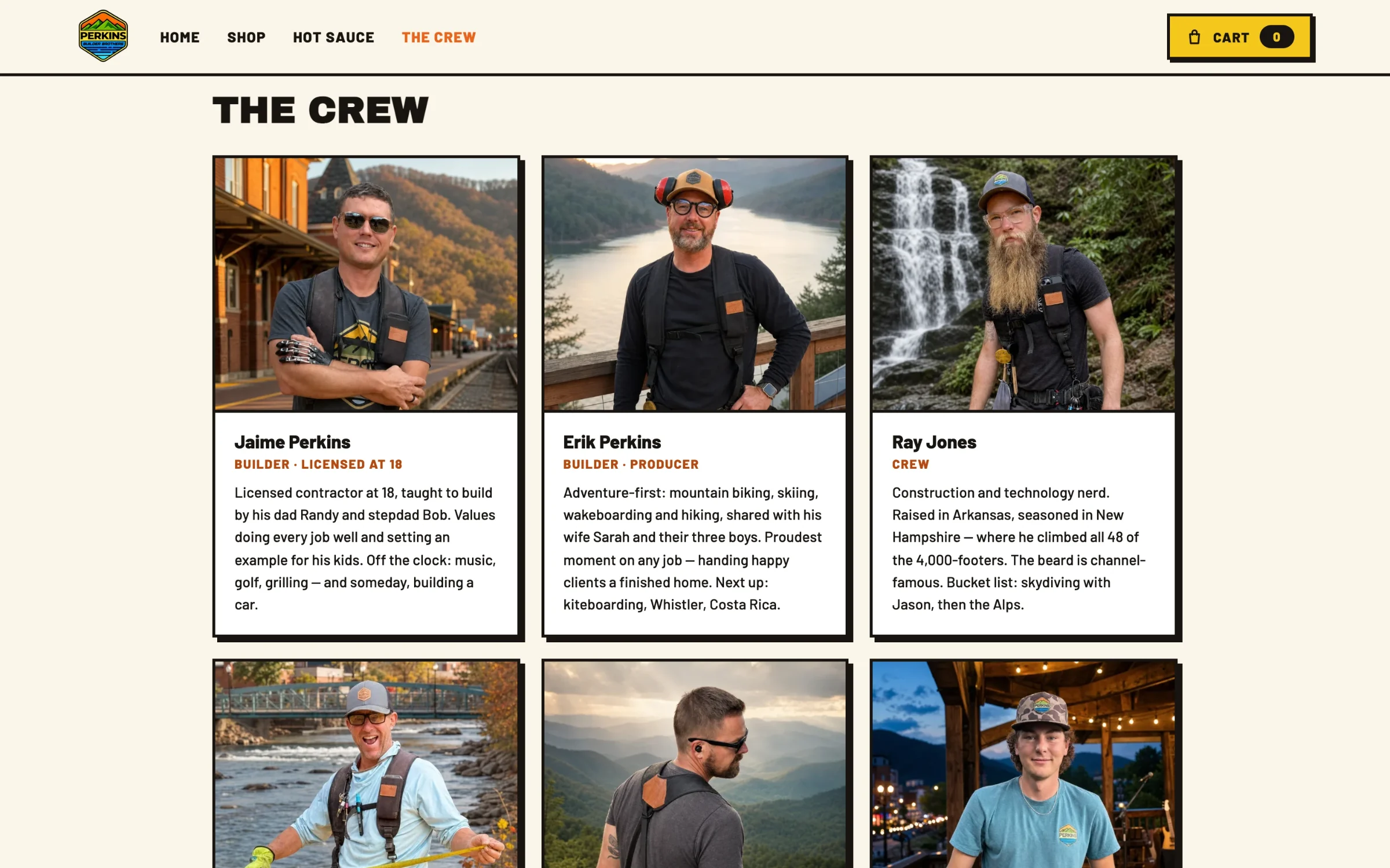
The people stay as visible as the products.
Responsive system
The same voice,
rebuilt for a smaller screen.
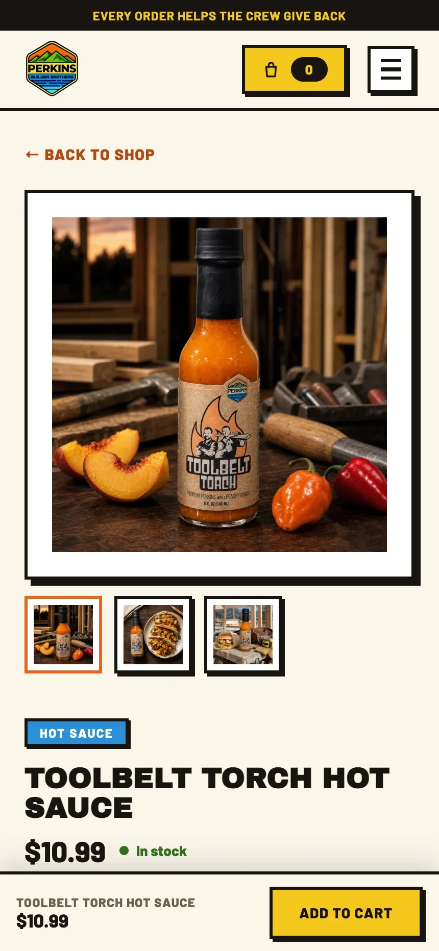
Most of this audience arrives from a video on a phone. Headlines reflow, catalog controls condense, and every product action stays comfortable for one-handed use.
- Imagery leads. The product photo fills the first screen, with the thumbnail gallery one tap below it.
- Details stay clear. Category, name, price, and stock in the same order as the desktop page.
- The cart never leaves. A sticky bar keeps the price and add-to-cart within thumb reach as the shopper scrolls the story.
What we made
The crew's voice,
all the way to the cart.
Storefront strategy + content architecture
Shaped around how the crew's audience shops: home, gear, hot sauce, and the crew, with cart actions one screen away everywhere.
Art direction + visual system
A bold system of condensed type, jobsite color, hard shadows, and workshop photography carrying the Perkins voice through navigation, catalog, and product pages.
Product storytelling
Workshop photography, flavor notes, heat levels, and food pairings give each hot sauce its own story before the shopper reaches the product page.
Responsive UX + front-end development
Browsing, product detail, and cart actions kept clear on every screen, built as a fast custom front end.
Every screen had to feel like it belonged beside the crew's videos, tools, and merchandise.

Project lead
Brendan Collins
Brendan led the storefront strategy, content architecture, UX/UI design, responsive system, and front-end build for Perkins Builder Brothers.
The central decision was to keep the volume up: let the type, the color, and the crew carry the personality, and make the shopping path underneath it plain and fast.
Meet the studioYour next chapter
Build a store that feels
like your business.
Tell us what you sell, how people choose, and what makes the brand worth remembering. We will design the storefront around it.
Start a projectMore Collins Creative work