Five pages, one path
Classes, schedule, the studio, membership, and instructors, connected so every page ends in a clear call to book.
Pilates | Barre Five-page website + booking experience
We designed and developed a five-page website connecting studio atmosphere, classes, scheduling, memberships, instructors, and a guided booking path.
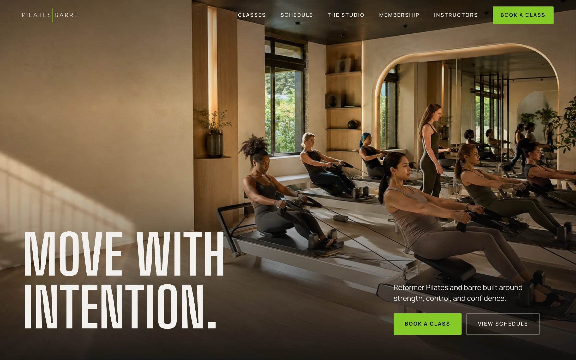
The finished website, interactive
This is the working site, not a mockup. Scroll the homepage, filter the schedule, compare memberships, and open the booking flow on desktop or on a phone. Booking is disabled inside the preview.
The challenge
Pilates|Barre offers different class formats, two rooms, multiple membership paths, and a team clients want to know. The website needed to make that depth feel inviting, not complicated.
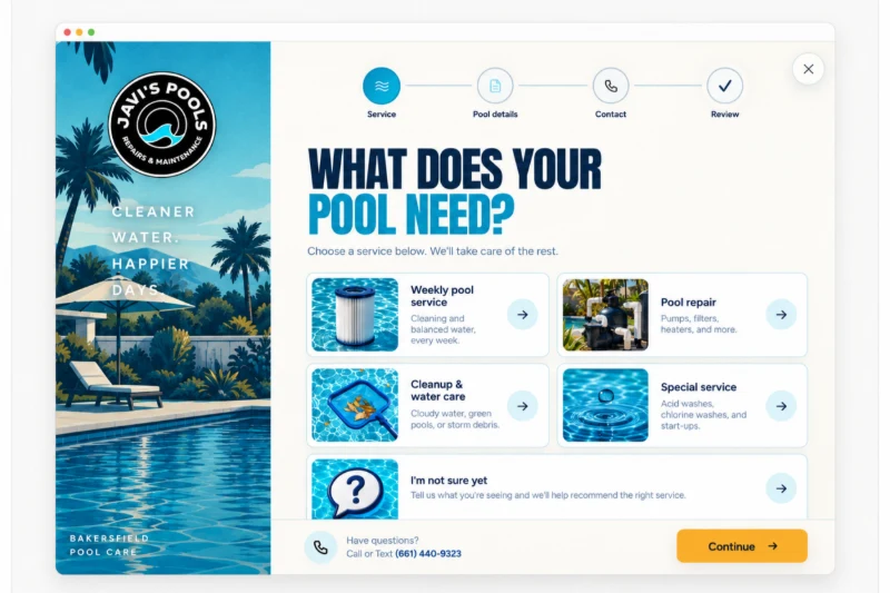
A focused four-step booking popup helps first-time and returning visitors choose a class, date, and next action without losing the studio context.
Art direction
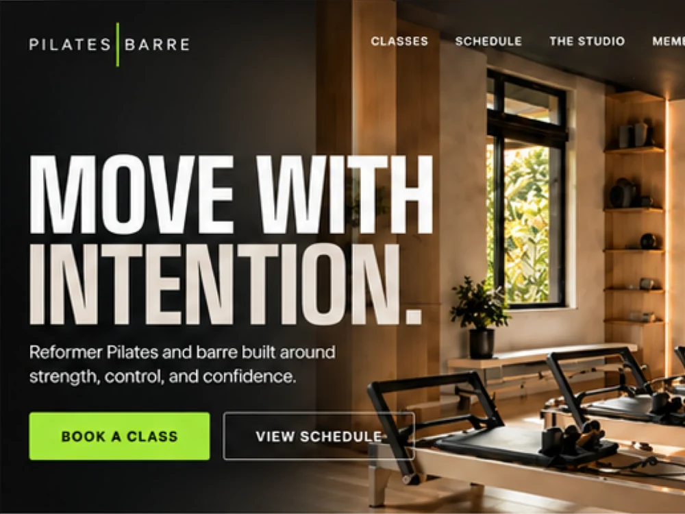
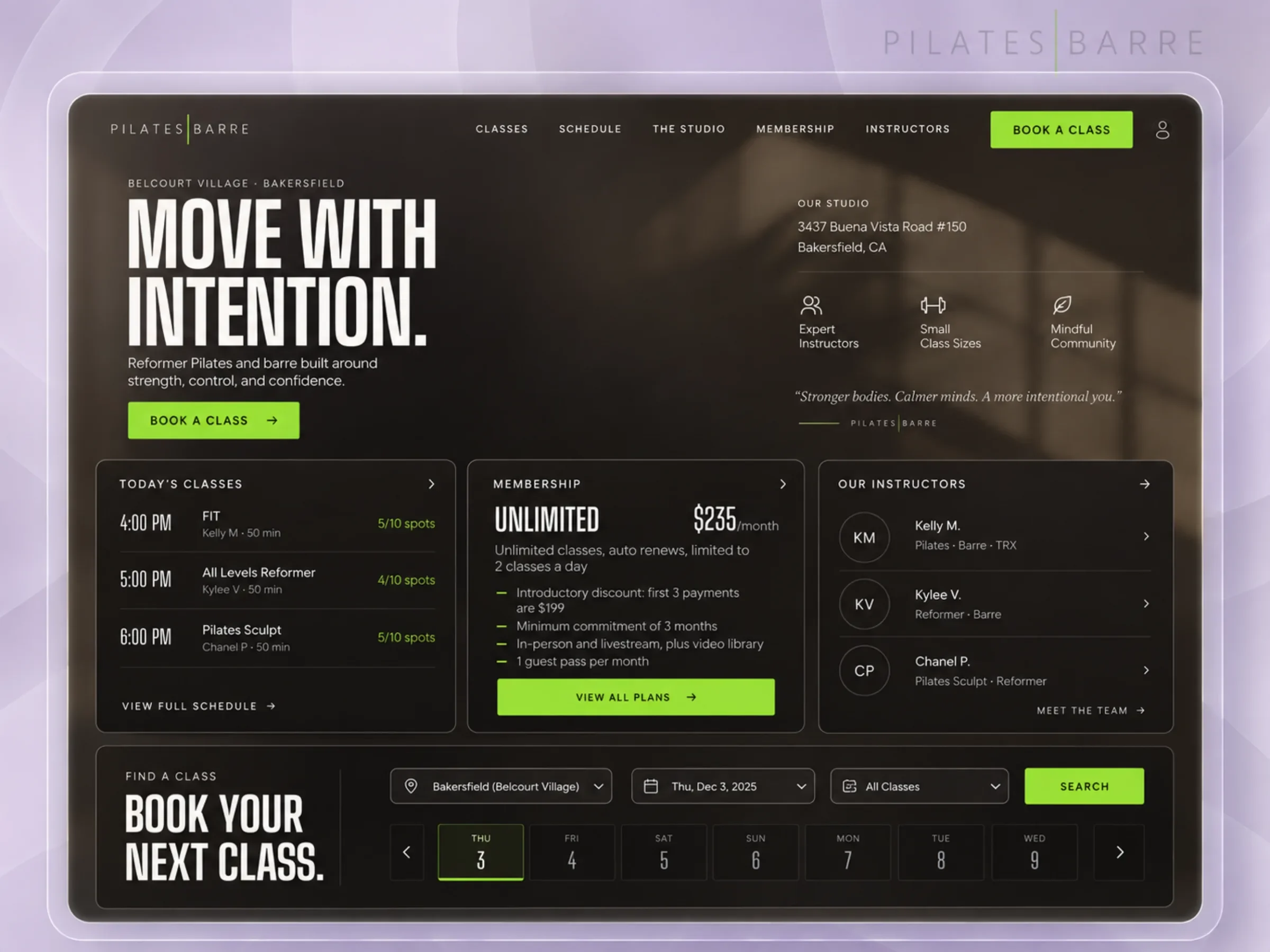
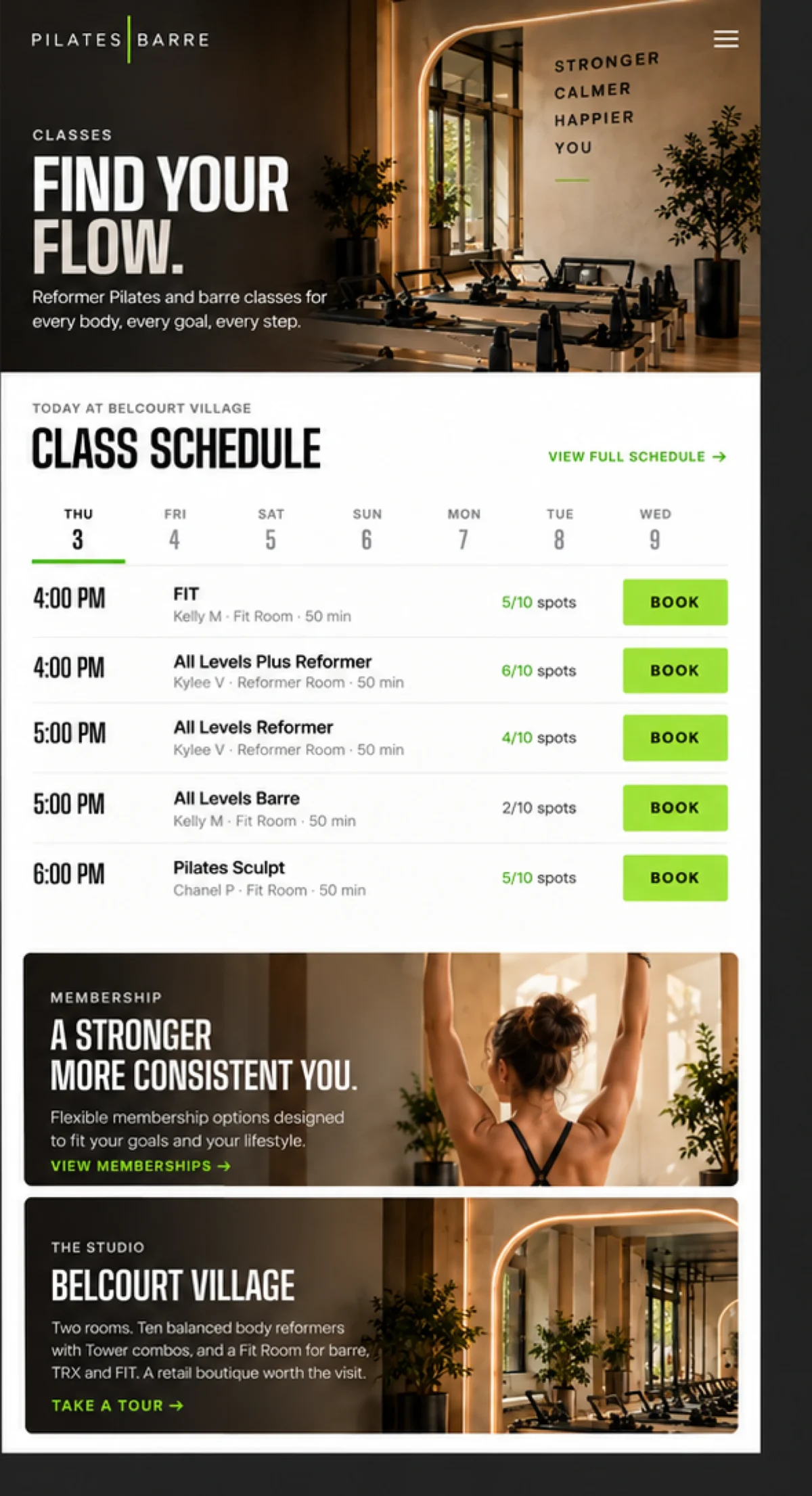
Warm architectural photography introduces the two-room studio, ten Balanced Body reformers, and the people who make the experience feel personal. A confident visual language built from real photography, condensed display type, off-white copy, and electric lime actions carries it across every page.
Move with intention.
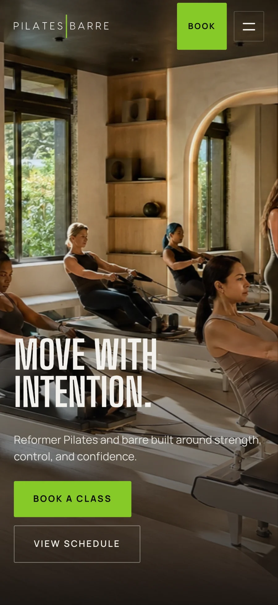
Stronger. Calmer. Happier. You. Short lines, set in tall condensed caps, over photographs of the real room.
Decision design
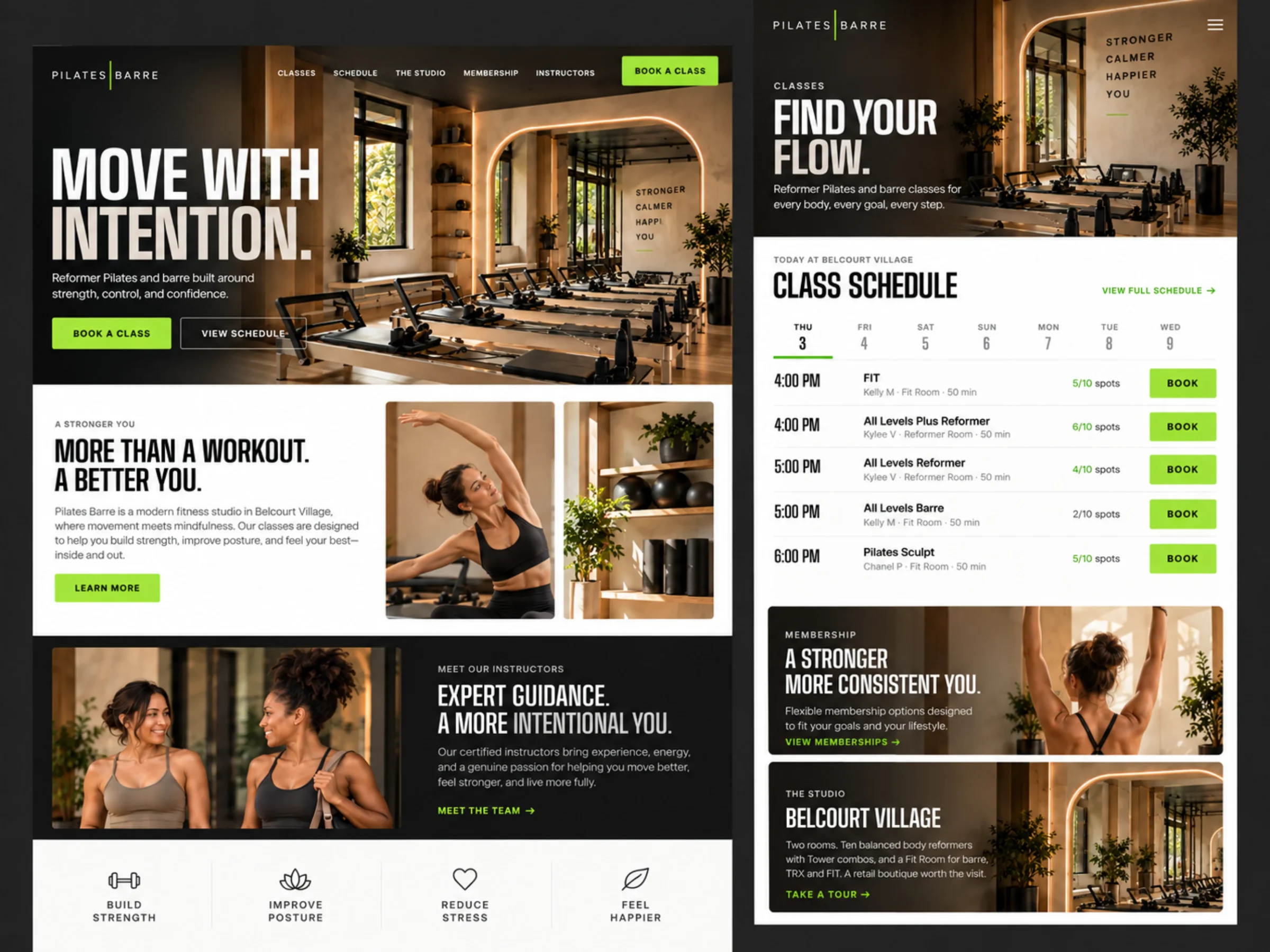
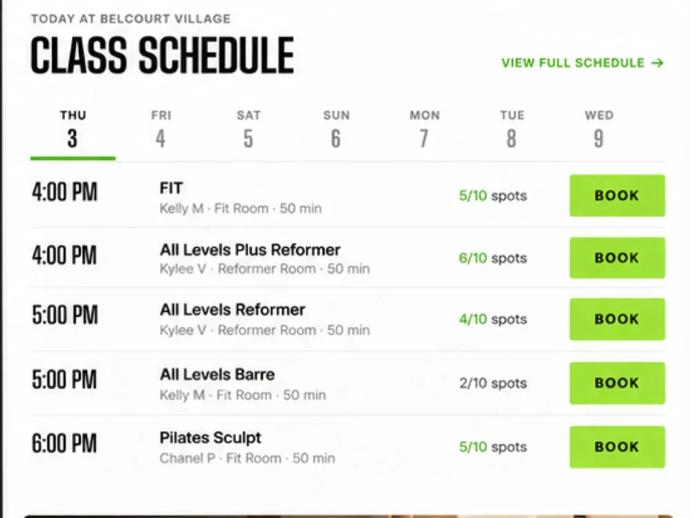
Filters, day states, availability, plan groupings, and direct actions create a consistent rhythm across the most information-dense pages. Class type, day, time, instructor, room, duration, availability, and booking action remain legible without turning the page into a spreadsheet.
What we built
Classes, schedule, the studio, membership, and instructors, connected so every page ends in a clear call to book.
Warm architectural photography, condensed display type, off-white copy, and electric lime actions on every screen.
Schedule filters and availability states, membership comparison with one recommended path, expandable instructor bios.
Navigation and the four-step booking flow designed for desktop, tablet, and one-handed mobile use, with local SEO for Bakersfield searches.
Make the depth feel inviting, not complicated.

Project lead
Brendan led strategy, art direction, UX/UI design, and the front-end build for Pilates|Barre.
The central decision was to let the room set the tone and make every information-dense page (schedule, membership, instructors) read as a short list of easy choices.
Meet the studioYour next chapter
Tell us how people find you, what they need to decide, and where they get stuck. We will design the path around it.
Start a project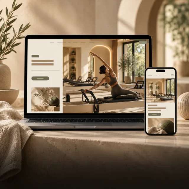
More Collins Creative work